Customised Packing Service
Our custom packaging service puts you in control, allowing you to choose the shape, size and material for your boxes, as well as print custom messages on the the products packs, bags and labels.

Pouch Designs
Vegetables Packaging
13 packs that add extra to the ordinary
Cartoon characters
Brightly coloured, stylised characters are always bound to catch our eye and capture our imagination. They bring us back to our childhood and put a fun twist on usually boring everyday products.
Art materials
These packaging designs unleash our inner creativity. We think the parmesan pencil and sharpener are particularly clever.
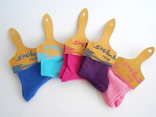
Socks made to look like paint brushes. There’s no link between the two but it’s interesting nonetheless.
Recognisable objects
By embodying a range of familiar everyday items, these products shake up the packaging status quo. A pizza box that opens like a Babybel? Why not?
Different for different’s sake
This rice packaging defies all convention. Definitely one for the creative chef, there’s no doubt that this futuristic design would stand out on shelf against the transparent bags and pouches we normally get our rice from.
Coconut water pack designs
Low calorie, naturally fat/cholesterol-free, and with potassium levels that bananas can only dream of, it’s no surprise that coconut water has taken the swelling health-minded population by storm.
An abundance of athlete and celebrity endorsements, including mononymous superstars Rihanna and Madonna, have aided a surge in the popularity of this super hydrating beverage in the States. An impressive stunt by category leader Vita Coco on London’s Southbank recently confirmed an equally significant marketing push to increase its profile in the UK.
Vita Coco’s recent marketing stunt in London.
As it’s often positioned as a premium product, coconut water brands have turned to packaging design to convince consumers that it’s worth a little extra cash.
Tropical paradise
The exotic connotations of coconut water mean that many brands focus their packaging design on the romance of the tropical paradise. Bright vibrant colours not only provide shelf stand out, but also invigorate the category. The designs seek to convey provenance through the stereotypical idea of coconuts growing from an Antiguan palm tree lining a bright blue ocean.
100% natural
Promoted as a healthier alternative to many sports drinks on the market, there is a distinct focus on natural science over its artificial twin within this category. Consumers choose coconut water for its natural benefits and to avoid chemical additives at all costs. Neutral colours let the product do the talking, with hints of green indicating fresh, organic ingredients.
Hydration
As the ultimate thirst quencher, these brands have chosen to emphasise coconut water’s mouth-watering quality on pack. Energetic aqueous splashes take centre stage and illustrate that these beverages are bursting with hydration, while subtle colour palettes complement coconut water’s thirst-quenching abilities.
Tins Designs
The demand for less disposable packaging is increasing as consumers become ever more aware of environmental factors. Enter, the tin.
As collectible rather then disposable packaging, the tin provides a fantastic opportunity for great design using eco-friendly materials. It’s invading all categories of packaging, from tea bags to t-shirts, from watches to wine, and is lingering in consumers’ homes long after its contents have been used. Your tin might be holding pencils, storing souvenirs, or simply looking pretty. Plus if it’s in your home, it’s not in a landfill.
Mini masterpieces
These designs blow all expectations of canned goods out of the water. Mastering beautiful design, their keepsake status elevates these everyday objects into the realms of art.
Beauty products are often packaged in tins.
Out of the ordinary
Not what you might expect, tins are taking ordinary items into previously unexplored territories. They construct the extraordinary out of the mundane, and all in an eco-friendly way. Pretty perfect, right? The canned watches are a particular favourite of ours.
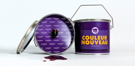
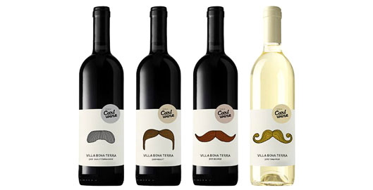
Red Wine like you’ve never seen it before.
One almost can’t imagine a Patagonia fleeced young fella without a moustache to complement his normcore styling these days. In fact, stop and take a quick look around your studio or the tube, or wherever you may be right now. How many boys-to-men are sporting whiskers? The message is clear – furry lips are cool again.
Not only does the moustache remind us of ‘the good old days’ when commuters rode penny farthings instead of Bradley Wiggins’ training bikes, but it’s just plain funny. Not many things can match a moustache that’s grown beyond the realms of the face taking a twiddly or bushy life of its own.
Humour continues to be a powerful driver that brands can use in attracting consumers. Thus, including a moustache in their packaging is a surefire way for them to do so.
One would be entirely justified to feel that their liberal application to branded packaging is slightly overkill, but we can’t help but love them. And so we dare you to look through the packaging gallery below without cracking a smile.
As far as moustache inspired packaging design goes, these paint brushes are Mecca.
Glass Beverage Bottle Designs
Modernising tradition
These brands take lemonade to newer, fresher places. Vector graphics are commonplace, giving the bottles a clean, crisp finish and propelling this citrus beverage into the 21st century.
Less is more
Offering minimal distraction, these brands let the lemonade do the talking. So we will too.
Limonata
In a totally different direction, the Europeans take lemonade to much more adult but no less fun place with illustrations of vintage pin-up girls give ‘limonata’ a sexy sophistication.
Natural goodness
These lemonade brands are keen to make sure their natural ingredients take centre stage. Fresh, bright illustrations certainly ensure that fruity goodness becomes the star of the show, with product descriptions playing only a secondary role.
Hard lemonade
In 1999, Mike (real name Antony von Mandl) grabbed hold of lemonade and decided to give it an alcoholic kick. Many have followed suit since and they’re now an everyday occurrence on supermarket shelves. Keep your eyes peeled though: there’s not a whole lot to indicate that these are strictly for grown-ups.
10 explosive firework designs to set your 4th July weekend off with a bang
“The day will be most memorable in the history of America. I am apt to believe that it will be celebrated by succeeding generations as the great anniversary festival. It ought to be solemnized with pomp and parade, bonfires and illuminations from one end of this continent to the other, from this time forward forever more” – Adams, J. (1776)
It’s the biggest day in the American calendar and, as declared by John Adams in 1776, fireworks are an essential part of the celebration. But how do you sell this oxymoron of dangerous fun? Firework packaging is contradiction on a stick (quite literally sometimes) with bright colours and thrilling names sitting alongside huge safety warnings and grave danger of death notices. Getting the equilibrium right can be a tricky task, but is essential to success.
Here we take a look at how it’s been tackled over the years in a tribute to Americans everywhere. Happy 4th July!
Turning back time
Brightly coloured illustrations and geometric shapes.
21st century entertainment
Fireworks need to get bigger and better every year in order to keep people interested, and the same goes for their packaging. Modern designs are increasingly minimal. 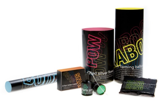
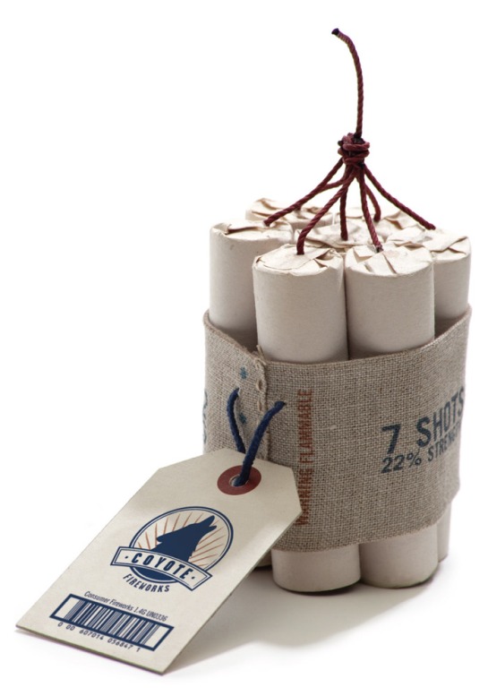
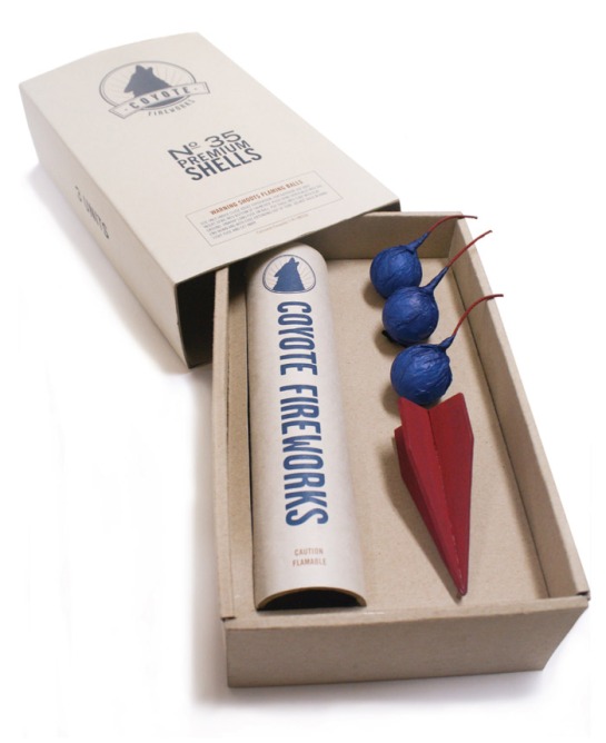
Horror stories
Rollercoasters to hell. Space aliens. Volcanic eruptions. Bring it on.
Go hard or go home
They may not come in the prettiest packaging, but these fireworks embody America’s bold confidence, taking sparklers and roman candles to the extreme.
4 brands with their eyes on a Grand Slam title at SW19
With, let’s face it, disastrous results at the 2014 World Cup in Brazil, it’s fair to say that English attention will now be firmly fixated on this year’s Wimbledon Tennis Championships.
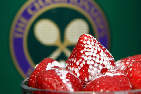 Although traditionally associated with hushed intensity, there is nothing quiet about the hype this quintessentially British affair attracts each year. And after Andy Murray’s spectacular triumph last time out, expectations will be sky high.
As the tournament gets off to a sunny start this week, here are four brands that have put us in the Wimbledon spirit.
Lanson
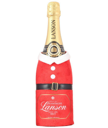
You’ll be in no doubt over which event you’re toasting with Lanson’s garish yet great champagne cooler. The neoprene jacket can be used year after year and makes a great addition to any Wimbledon party. Hopefully it’ll be more for celebrating success that drowning sorrows.
Jacob’s Creek
Jacob’s Creek is an official sponsor of the Championships and its packaging does nothing to dispel that fact. It’s obviously read the rules and dressed in all white. The use of Wimbledon’s signature purple and green colour palette provide the kind of equity that drives consumer recognition and sales.
Ralph Lauren
The ultimate in preppy fashion, Ralph Lauren has been kitting out the Championships since 2006. The brand was the first designer to partner with the All England Lawn Tennis Club and dress all on-court officials. Their classic style now defines the tournament.
Sugarpova
These tasty treats serve more than one tenuous tennis connection. Not only are they linked to the grunting Russian beauty Maria Sharapova, but there’s even chewing gum shaped into tiny little tennis balls, perfect for mini matches in the office. What could possibly get you more in the mood for tennis than that?
Packaging Gallery: Alcohol brand Brazil 2014 World Cup editions
We looked at the beautiful limited edition 2014 Brazil World Cup packaging designs from the tournament’s official partners earlier this month (read it here). Now it’s time to explore the celebratory packs that have hit shelves from alcohol brands that haven’t paid to be official sponsors, but are riding the publicity wave anyway.
Tsingtao Beer
Though China’s football team isn’t competing at the tournament, this design will ensure that its leading beer brand is competing at shelf. Given that its brand spirit is all about passion, dreaming and celebration, it seems a perfect fit for Brazil 2014.
Cruzcampo Beer
Spanish beer brand Cruzcampo depicts the defending champions on its limited edition Brazil 2014 cans. You’d imagine they’d be beginning to regret it after the team’s 5-1 thumping at the hands of the Dutch last week.
Ozujsko Beer
Ožujsko beer is an official sponsor of the Croation National team for Brazil 2014. They’ve gotten behind their team with this design. Consumers will be kept busy looking for a can with their favourite player’s name.
Heineken Beer
No prizes for guessing who Heineken are supporting here. The design is a colourful celebration of heritage and nationality. Can the Oranje go one step further than they did in South Africa four years ago and win this thing?
Tattinger
Joining the host of beer brands capitalising on the biggest sporting event this planet has to offer is Tattinger. Not supporting a particular team like most of the beer brands, the famous champagne balances premium appeal with the sport of the people.
Nescafé
Nestle’s first offering is a category unique consumer-focused innovation for instant coffee brand Nescafe. It’s new coffee jar comes complete with a 3D-printed alarm clock lid which is only de-activated when unscrewed. Bringing fresh meaning to ‘Wake up and Smell the Coffee’, it’s endearing, completely memorable and certain to wake up any sleepy competitors who have fallen behind.
Coca-Cola
Coca-Cola and FIFA have been in partnership since 1950 and the lovers are still going strong for Brazil 2014. Street Art is huge in Brazil and Coca-Cola’s World Cup can design joins McDonald’s fries (above) in celebration of painted cities. A result of a collaboration with Sao Paulo street artists Speto and BGO, the designs feature the faces of four young Brazilians.
Budweiser
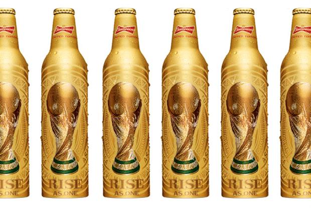 In tandem with its World Cup positioning ‘Rise As One’, official sponsors of the 2014 tournament Budweiser unveiled this limited edition beer bottle. No matter which team emerge victorious, everyone holding a Budweiser will feel like a winner.
Castrol
Castrol’s lubricant range is looking better than ever for Brazil 2014. Using a unique sleeve design the packs are literally ‘dressed’ in the colours of Brazil. The optical illusion-like pattern was created by another true-blue Brazilian artist: Cristiano Siqueira.
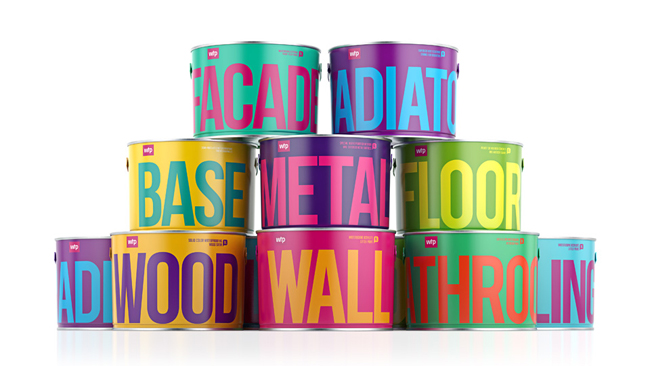
With competition in the segment becoming fiercer, paint brands have begun doing battle through packaging design. It makes sense: if the promise of a product is to make something else look good, it’s got to look good itself.
Colour Expression
Light years away from the category cliché of featuring lifestyle photography depicting unrealistically attractive people decorating their perfect homes, these slick and straightforward contemporary designs aim to inspire with abstractedness.
Colour by Nature
Want to bring the outdoors indoors? The beauty of nature is something that you can never truly manufacture. But you can still give it a try with a quick lick of paint.
Character
If you thought painting was a boring chore these brands will make you think again. The use of illustrated characters is used across many categories to target kids as well as adult’s inner-children.
There’s nothing more attractive than a good sense of humour and their aren’t many better ways for a brand to connect with consumers than by making them smile.
Educate To Inspire
Buying paint can be a stressful and unnecessarily strenuous challenge. That’s why so many people spend such a long period of time agonising before arriving at the inevitability of Magnolia.
Luckily, some brands have taken the initiative to spell it out and impart their expertise to confused consumers.
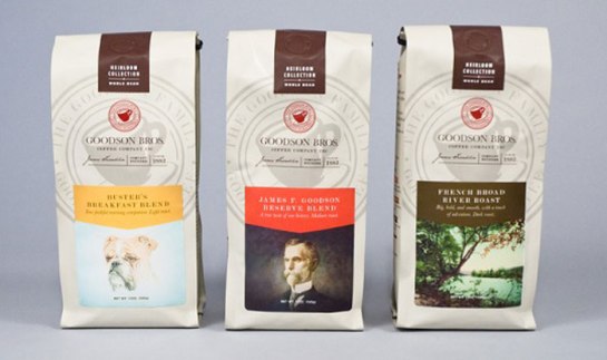
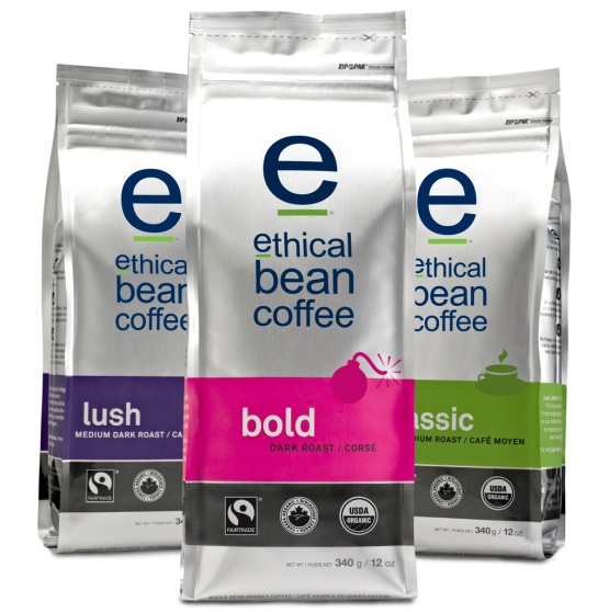
8 Packaging Designs for the Caffine Connoisseur
Coffee, like wine, has become a product for aficionados. Consequently, a substantial market for high-concept bags of beans has evolved, with each brand using design as its weapon win the battle to become the coffee enthusiast’s preferred brew.
Below are a few examples of what a 21st Century caffeine connoisseur would be more than happy to wake up next to.
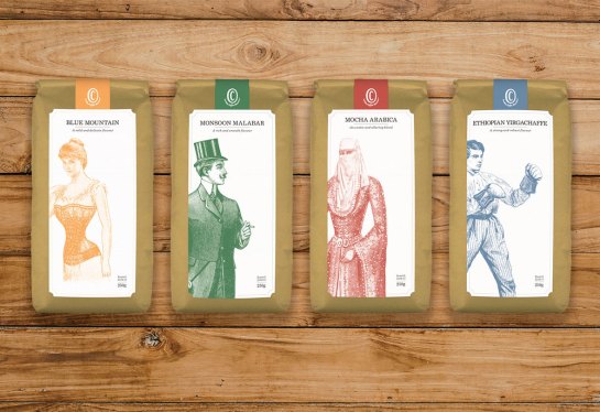
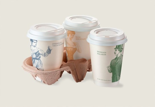
Faux-Victorian
19th Century etchings instantly inject a brand with character.
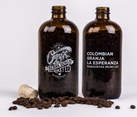
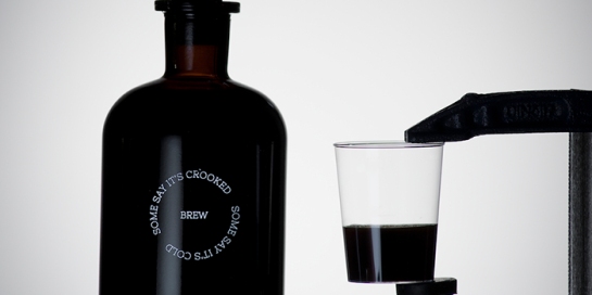
Black Bottles
Causing coffee to look like something between a cooling cordial and a mysterious medicine bottle from an apothecary shelf makes more sense than you might think.
Opulent
Black & gold? Check. Re-appropriated Art Element? Naturally. Instant take-me-home level of attention? You know it.
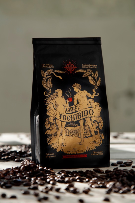
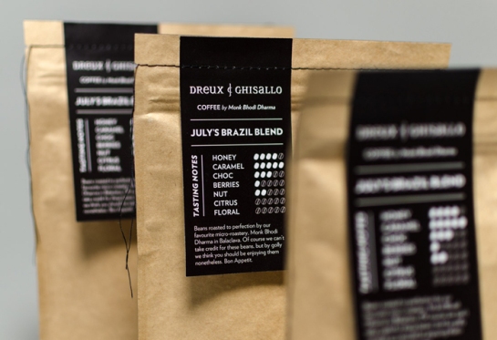
Guiding Lights
Bean boffins will tell you that coffee is a pretty complex entity. A fun, striking or unusual navigation system built into the overall design takes the stress out of choosing a coffee without detracting from the premium experience.
Beyond Bling: Designing Premium For The Masses
In the years of consumer excess that dominated most of the 20th Century, a premium brand had to be exclusive, ostentatious and downright unaffordable for the average man in the street. The premium label was the reserved for the luxury goods and the likes of Rolex, Jaguar and Dom Pérignon. These brands were owned by an exclusive club of the few who could afford them and a mere aspiration for those who couldn’t.
Brands like Dom Perignon and Rolex have a quintessentially luxurious heritage.
Things have changed. In the age of the individual, premium products are no longer conspicuous items of desire but everyday luxuries that make consumers feel good. This can mean anything from pet food to deodorant to table salt.
Want to take your brand to a premium place? Here are the three major pathways to designing democratic desirability:
1. Simplicity
To give your brand a premium look and feel, it needs a certain sleekness, sophistication or the merest suggestion of chic. That means clean lines and minimalism in a category where the ‘everyday’ offerings are covered in busy graphics and bright colour. If you want to make a statement about your product’s superior quality, an understatement is the only one you need.
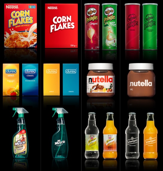
Though these pack designs are just concepts, they do a great job of showcasing premiumisation happening through pure simplicity.
2. Create Luxury Through Choice
An intuitive way of making consumers instantly connect a product with ‘premium-ness’ is to position it as part of a range. When premium products are all about personal choice, creating space in your portfolio for something special and a little set apart from your core offering can work wonders by inspiring consumers to treat themselves.
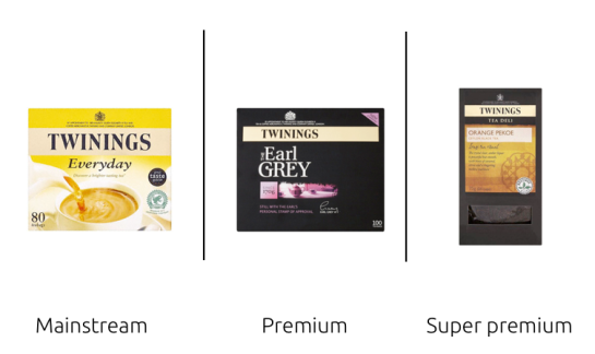
Twinings Earl Grey (middle of the range) is designed with premium cues and sits in the middle of the range. As a result the Tea Deli products at the summit of the range become super-premium in relative terms.

Johnnie Walker’s whisky range is a great example of how changing colour, typography, bottle shape and graphics can heighten premium appeal gradually through several tiers.

Asda’s own label ready meals represent an example of premium creation at the top end of a budget range.
3. A Compelling Narrative
Stories are what make us human. Brands that connect you to a person, place, event or something bigger are always more likely to be perceived as premium because a personal connection is a rare commodity.
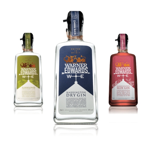
Warner Edwards is an Anglo-Welsh artisan gin with a unique brand story. The compelling tale is told through design on the pack. A weather vane represents several aspects of the brand story as it points west to east, from Wales to England, and from Warner to Edwards. Atop the vane, the Welsh dragon shares a glass with the English lion. This central lock-up is crowned with the brand motto “United in Spirit”, an entertaining wordplay encapsulating the rich brand story of Warner Edwards.
9 Tattoo Inspired Pack Designs
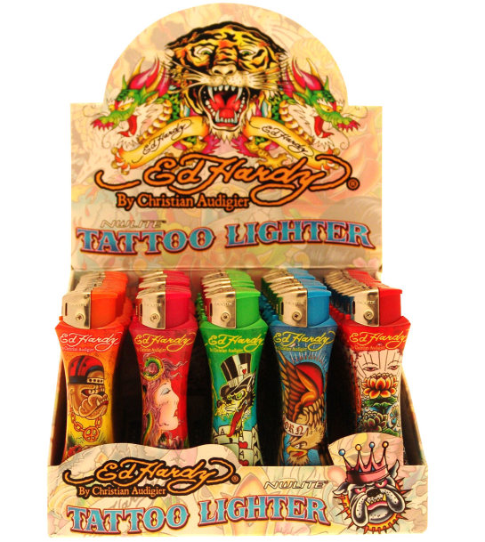
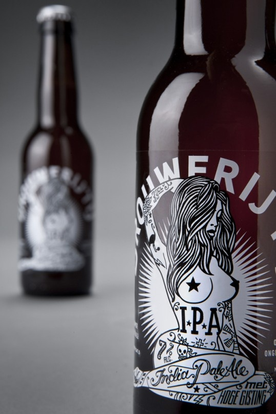
Several brands, particularly personal care and alcohol categories are inspired by tattoos. For some brands like Ed Hardy, the tattoo culture defines the look and feel of the brand, while other brands use tattoo art to promote a special product line or a limited addition.
Throughout time tattoos may have been relegated to various subcultures but given how common they have become, it’s fair to say that they’ve fallen into the stream of mass market mainstream culture. They are an expression that crosses social-economic lines and country borders.
Sailor Jerry’s iconic design is probably the best known example of tattoo inspired packaging.
But what exactly is it about tattoos that we find so appealing? They can be our stories, places we’ve been, past events we remember or memories we harbour.
Everyone has a dark side, the part of them that wants to drink, smoke and cause disruption and generally go against the grain of conformist society. Tattoos certainly appeal to this ‘dark side’ and the dangerous, edgy and expressive sensibilities that make it up. Tattoos are an international phenomena that can transport us to far away exotic places, igniting nostalgia, whether it be sailors on the high seas or the ancient rituals of Japan.
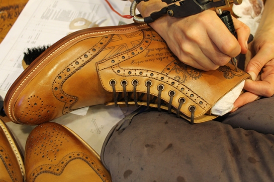
Often being used to create special and limited edition products. Hand drawn by the artist, they are completely unique and an apt reflection of their skill.
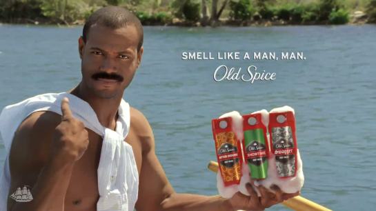
4 Ways to Approach ‘Masculine’ Packaging
Most of the time, when a brand wants to reach a male audience, it does so by changing the packaging to black, dark blue or silver. Effective, but obvious. This tactic instantaneously transforms any product into a sleek and powerful offering, strong enough for a man. Even yogurt becomes unfussy, un-fruity and serious.
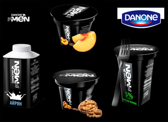
Danone’s yoghurt, specifically marketed at men recently launched with a sleek (if a little unoriginal) pack design.
Changing the pack to black is a proven formula but it’s not the only formula. What other design tactics can a brand employ to grab a man’s attention?
Science/Technology
Men want proof that the product they are buying will work. Furthermore, they like to be on the ‘in’ for the latest in technology – whether it’s a operating system or a razor. Dynamic shapes, technical language, clear product benefit communication and metallic colours are just a few of the design tactics to position a brand as scientific and technologically advanced.
Vintage
On the opposite side of the spectrum, men trust the original. They are a loyal lot that believe the old adage, if it ain’t broke, don’t fix it. Rather than modernising and innovating, brands with rich histories should celebrate it with a vintage treatment.
Humour
Men can be a little uncomfortable when buying personal care products that are specifically marketed at them. Humour is a great way to ease those concerns and make a brand approachable.
Materials
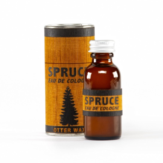
Using a unique packaging material can appeal to men’s desire for simplicity and strength. It makes a powerful understated statement and helps the brand stand out from competition at the same time. Exploring with materials like stone, metal and wood trigger a man’s propensity for something solid and real.
Appeal to the inner child
Things that look like spaceships and pictures of dinosaurs still appeal to guys. It’s a world they experienced as kids and remember so fondly. A place where they are comfortable.
Connoisseurs can look after themselves, but how can wine brands attract the mainstream?
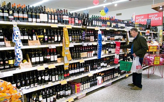
Generally speaking, the classic front and back label pack design system doesn’t change much from one bottle of wine to another. Although their are many wine connoisseurs out there able to understand what they are going to get from each wine before they buy it and pick out particular blends or taste notes, most consumers aren’t as educated. If a wine is good, the connoisseurs will seek it out, but how do wines market themselves to the majority of people who love wine but don’t have as much knowledge on the subejct?
Many consumers hold unsubstantiated prejudices against certain wines. It’s all too common that one bad glass of French red wine that someone drank five years ago has meant they’ve avoided all French wine since. If there are so many consumers failing to properly choose their wines by taste or avoiding them because of silly prejudice, then one can logically deduce that a brand telling a story, using humour or boldly celebrating its provenance could make a difference. Ultimately, none of these methods will work unless they are backed up by great structural or graphic design.
What are the areas that wine brands be looking to exploit and which ones are already there?
Storytelling
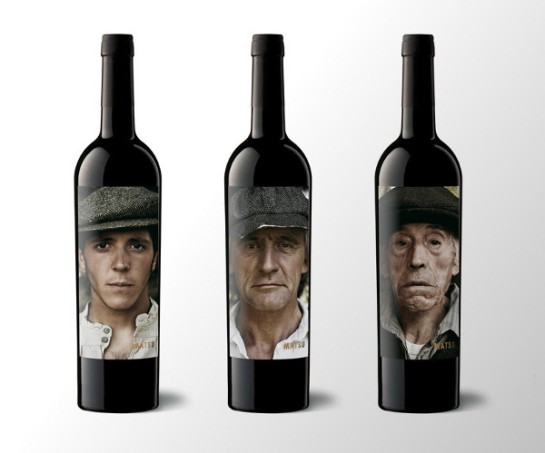
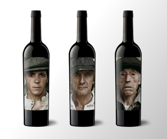
The bottles below from Matsu wines are adorned with photographic portraits depicting three generations that devote their lives to the Spanish fields from which the wine is harvested. The personality of each wine is reflected in each man’s character and expression. The story of the brand is at its heart and has a powerful appeal within it.
Provenance
One way wine lovers who aren’t connoisseurs choose their product is by the country its from. It makes sense therefore, to make the provenance very clear on the front of the pack. If the area of origination is widely known as a good one for wine, new customers will be attracted too.
Taste
A gorgeous, simple design that simply states the essential information that those who don’t know too much about wine want could be just the trick. Classy and unintimidating.
Curiosity
If the pack design is premium and it looks cool but have no idea what it is we may just give it a go. This method of choice isn’t recommended to cats.
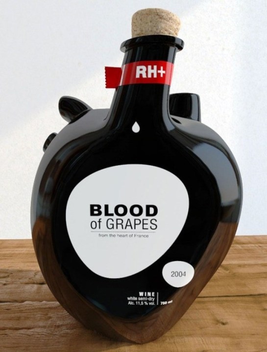
Humour
Humour is a universal language that is utilised to good effect across all FMCG categories. It works and can make even the most premium brand approachable.
Recent packaging and product innovation is reshaping the breakfast occasion that has remained pretty much the same since James Caleb Jackson invented the first breakfast cereal in 1863. These innovations are driven by a lack of time, an unfortunate downside of our increasingly busy lives. They are a response to the consumer need to ‘grab and go,’ so they can get to the office or to school with the necessary energy to take on their day. A proper breakfast is a luxury, and the innovations below help ensure that we don’t miss out on the most important meal of the day.
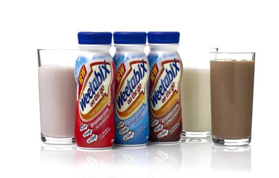
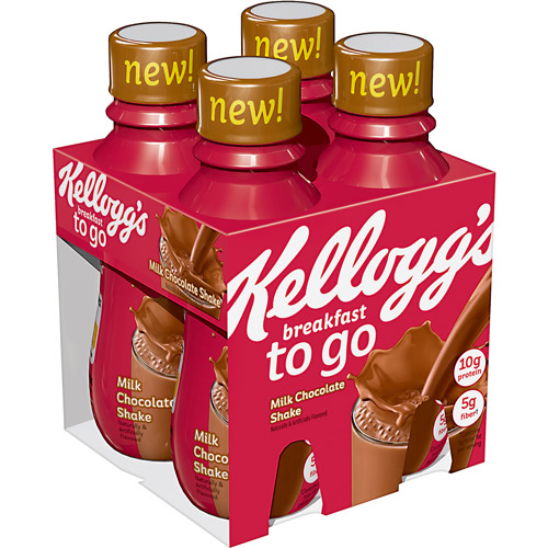
Breakfast drinks
Cereal brands make a move by expanding their offer to drinkable breakfasts. A good strategy as consumers already identify these brands with nutrition.
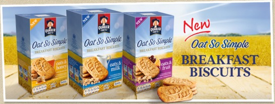
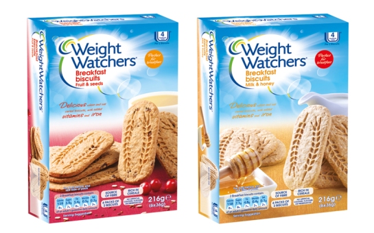
Breakfast biscuits
The brands below focus on making breakfast simple. A quick biscuit to nibble on with your coffee before you dash.
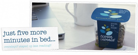
Breakfast cereal consumption innovation
For those who can make it without cereal, these innovations make just adding milk even easier.
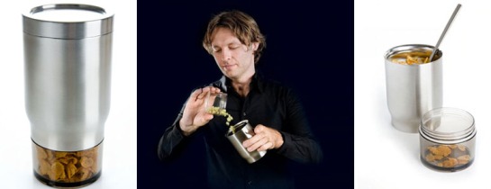
Like a coffee flask for cereal. Store milk and cereal in it and combine when it’s convenient. Repeat use is an environmentally friendly bonus of Royal VKB’s breakfast traveller.
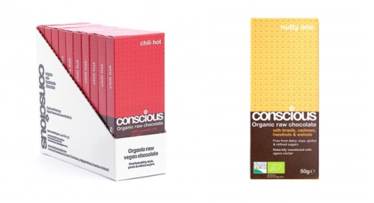
Arising from the embers of our addiction to chocolate are a collection of confectionary brands that offering a ‘healthy’ alternative. While the chocolate these brands offer may not be banana-brilliant for you or satsuma-salubrious, it is healthy compared to the Hershey’s, Cadburys and Nestles of this world. Some are designed to control portion size, others are gluten free and use raw ingredients.
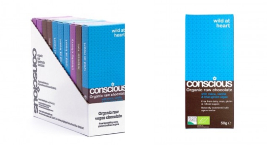
With healthy chocolate currently limited to the premium end of the confectionary category and portion size a major concern, packaging design is of the utmost importance for these brands. They manage this through utilising a combination of chocolate, premium and health design cues.
Conscious Organic raw chocolate is handmade and hand-wrapped in a sturdy card sleeve. A central health and wellbeing cue, the flower logo, creates the central pattern and the colour combos produce an aesthetically pleasing, muted texture. Its rounded font brand suggests warm, down to earth, no nonsense communication. At around £3.50 for a 100g bar, Conscious is as premium as they come.
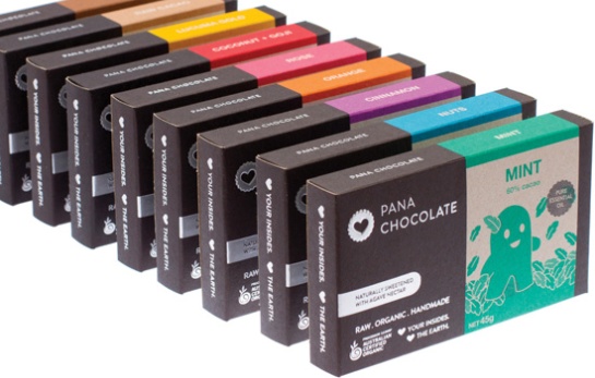
Cute illustrations combined with natural scenes depict an approachable brand which you can enjoy and indulge in without feeling guilty. Using fresh mint greens, bright pinks and vibrant light blues the designs generate a host of health cues to accompany the brown colour we expect from chocolate.
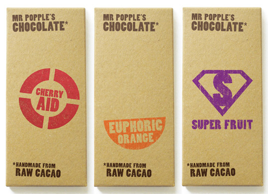
Mr Popple’s is a prime example of a brand emphasising the raw goodness of its chocolate with the material and natural brown colour of its packaging. Simple iconography suggests no hard sell, less is more. Bold and brash graphics drive the simplicity of natural appeal. The minimalistic design brings the most important content to the forefront of the pack on shelf.
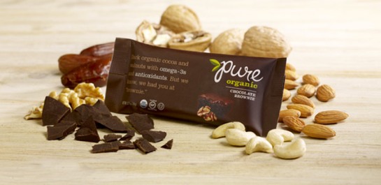
The deep brown chocolate coloured sleeve juxtaposes with the green and white of the logo and Pure’s ‘organic’ variant description. The green leaf pops out on pack to signify health cues amongst the indulgence of the brown wrapper and product image. Carefully crafted copy taking center stage portraying the brand’s confidence in its product. The pack definitely takes inspiration from cereal/breakfast bars in an effort to associate itself with the goodness they are perceived to possess.
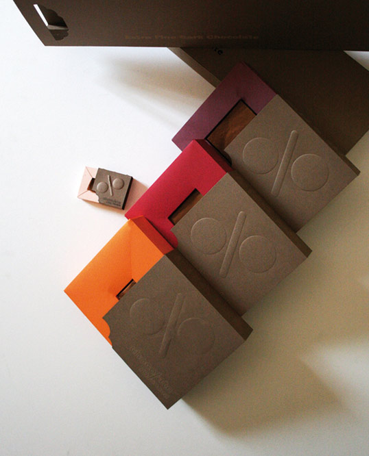
This brand using embossed graphics and bold simple colouring to sell it’s unique portion-control offering. So much so that the offering is the brand itself.
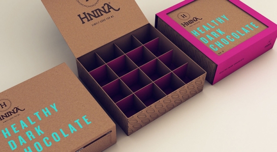
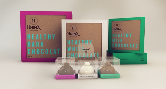
Once again Hnina reflects the raw natural qualities of its chocolate with brown, textured packaging offset by one other bold colour. The pink, white and green are health cues signifying indulgence but also freshness.
Once again the festive season is upon us and with it, the inevitable gaggle of seasonal limited edition pack designs. Brands are keen to associate themselves with the time of year defined by gifting and high spirits. Established brands can temporarily step outside the rigid expressions they portray for eleven months a year to reveal something a little different. People tend to relax and behave a little differently when on holiday, so why shouldn’t brands do the same?
ZEO Tingle Bells
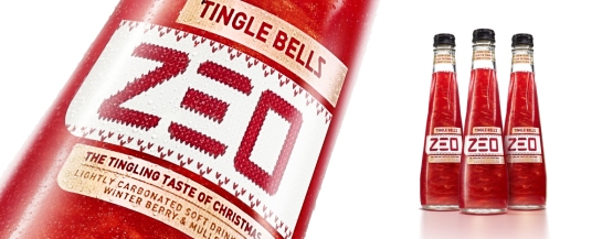
Tingle Bells is the first limited edition for low calorie drink brand ZEO. Designed by bluemarlin alongside the rest of ZEO’s range, the seasonal beverage plays to the signature tingling and warming sensation ZEO delivers. The design reflects this by embodying traditional seasonal sentiments of warmth, cosiness and cheer. Taking its inspiration from retro-style Christmas jumpers, the festive new look features a ‘knitted’ logo and a snowflake ‘stitched’ on to the cap. Metallic gold labels compliment the mesmerising sparkle of the beverage, which is created by an all-natural gold mineral.
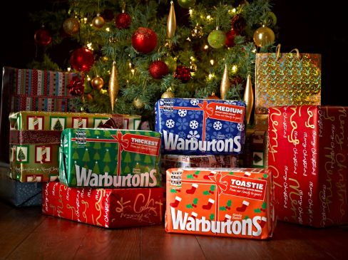
Warbutons
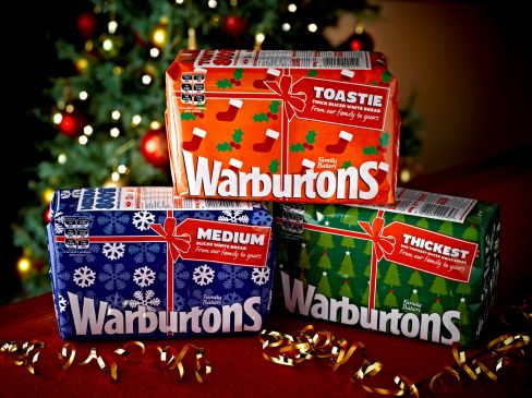
The lancashire-based bakery brand is looking to get the attention of Britain’s festive grocery shoppers over the next few weeks. The design plays on its the pre-existing likeness that its recognisable opaque wax packaging has to a wrapped gift. Perfect for making those Boxing Day sandwiches with the leftover turkey.
Lanson Champagne
A brand that’s a great believer in design and presentation, this jacket isn’t the first a Lanson champagne bottles have worn. This Santa Claus coat makes the Lanson stand out on a shelf a lot of us dive into at this time of year.
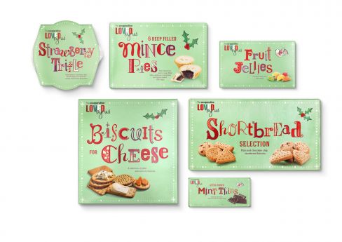 Co-Op Christmas range
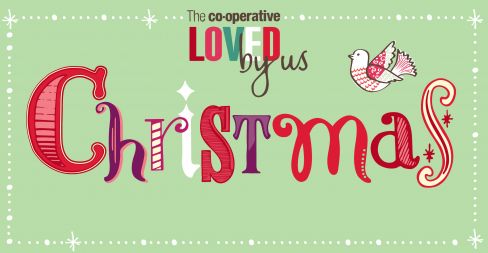
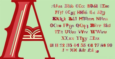
Co-Op’s treat range from shortbread to strawberry trifle has been united with a pale green seasonal pack design. The hero of the new look is the extensive typography, which provides an opportunity to communicate variants in a light-hearted and craft-like manner.
 Costa
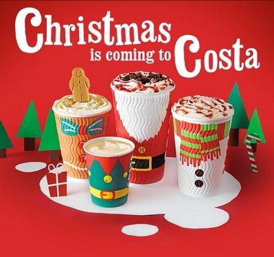
Costa
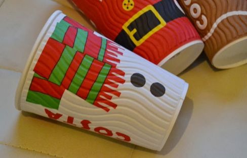
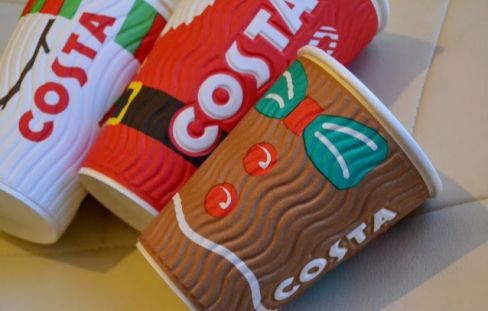
There are a few Costa and Starbucks fans that actually tick off the days until each of the coffee giants launch their Christmas range of packaging and cups. While Starbuck’s effort is pleasant it plays it pretty safe. Costa, on the other hand have produced a playful design that excellently utilises the ribbed texture of its cups. It’s funny, you’d think the snowman would melt with a boiling hot cappuccino inside him wouldn’t you?
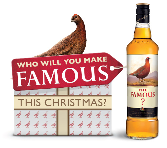 Famous Grouse
This is just about our favourite festive pack and campaign for 2013. We’ve seen the biggest brands in the world such as Nike and Coke’s focus on personalisation in their design and Famous Grouse has followed suit. Famous Grouse is almost definitely drunk more at Christmas than any other time of year and this campaign capitalises on that. Go on, make someone famous, even if they get a sore head and don’t remember it in the morning!
 Lyle’s Golden Syrup
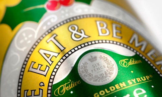
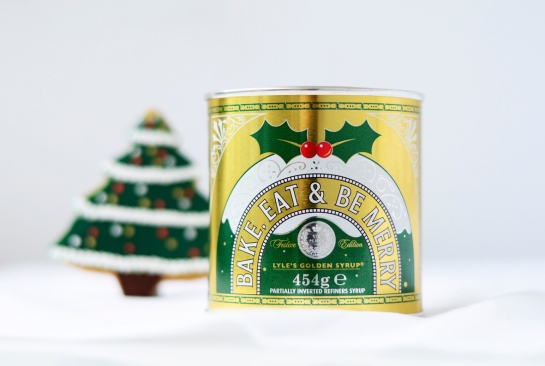
Lyle’s is one the oldest brands in the world. Wise therefore to keep the changes to its equity-charged pack design in tact. Holly and berries are added in cohesion with the existing colour palate and the products name is changed to a message to ‘bake, eat and be merry.’ Charming stuff from a British legend.
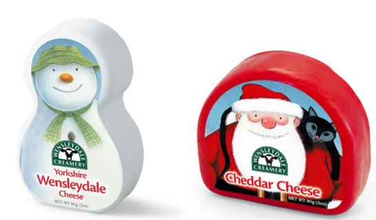
Wensleydale Creamery
Continuing it’s relationship with Snowman Enterprises and Channel 4, the Yorkshire Cheese brands has decorated it’s waxed cheese range with Raymond Briggs’ iconic Christmas character illustrations. The design follows the airing and huge success of The Snowman & The Snowdog film in the UK last December.
Pringle all the way
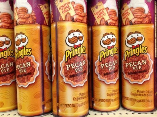
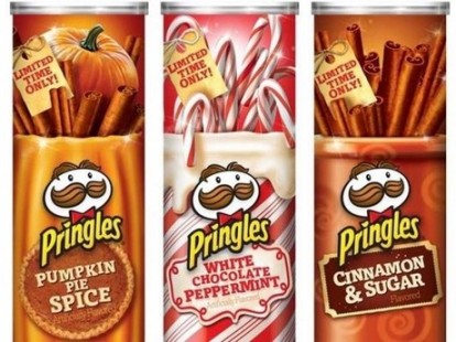
Each year around this time, Pringles hits the US and UK shelves with new, limited-time-only, holiday-themed flavours.
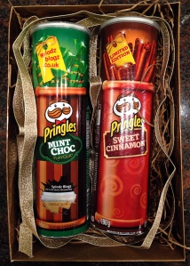 The flavours are festive and unexpected. They are flavourful and experimental products that are likely to be disgusting. White Chocolate Peppermint, Cinnamon Sugar and Pumpkin Pie Spice, Pringle’s previous seasonal flavours, are being followed this year by Mint Chocolate for the UK, and Pecan Pie for the US market.
Pringles has always been the unexpected chip/crisp. Its efforts at category differentiation have lead to rivals protesting that the saddle-shaped snack failed to meet the definition of a ‘potato chip.’ (In 1975, the US FDA allowed Pringles to be described as ‘chips’ as long as it was in the sentence – ‘potato chips made from dried potatoes.’)
Pringles makes a point to be different. It comes in a tube canister instead of a bag. It pops! rather than crunches. It’s a brand with a great sense of humour, a unique zaniness, and it’s willing to go out on a limb to make a distinct impression, even if it could be a disaster at shelf.
The buzz around these limited-editions is mainly created by those cringing, describing the flavours as a real fright to the tastebuds. However, there’s buzz. People are talking, and more importantly, their talk provokes people to taste for themselves. (NPR just ran a short satirical piece on ‘Sandwich Monday‘ in which the staff tasted the brand’s Pecan Pie and offered humorous quips about the flavour experience. Read it.)
How smart is it for a brand to put something on the market that is regarded as particularly unappetising? Furthermore, how smart is it to do this year after year? Is this another case of innovation getting out of hand or is there something sharp in Pringles’ strategy here?
Our opinion – definitely a brave move that strengthens the brand.
The holidays are a difficult time to ‘break through’ at shelf. Every brand is bringing out the bells-and-whistles to the point where special doesn’t mean that much. But Pringles offers a flavour and social experience that could very easily become a holiday tradition. It’s something brand lovers and families can look forward every year – ‘What flavour is it this time?’
Only a brand like Pringles, with its energetic and fun personality, a strong consumer following and a portfolio of core flavours that people know and love, could pull something like this off. You expect the unexpected from Pringles, and so when it delivers, its enjoyable. Therefore, as much as it might make our stomachs turn a bit, we are looking forward to how far Pringles can take it. And if the brand is open to some suggestions, we’ve got a few. How about Spiced Eggnog, Frosted Gingerbread, or Aunt Lucy’s Fruitcake flavour for next year?
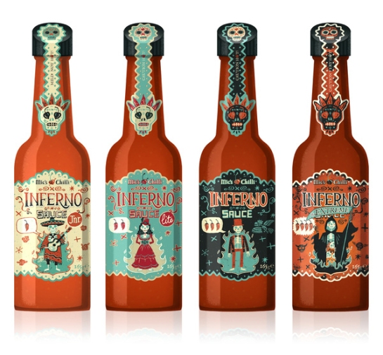
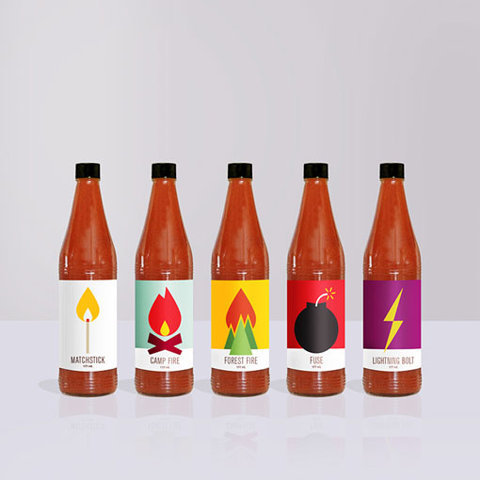
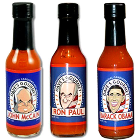
WARNING: 13 Mouth Burning Hot Sauce Packs
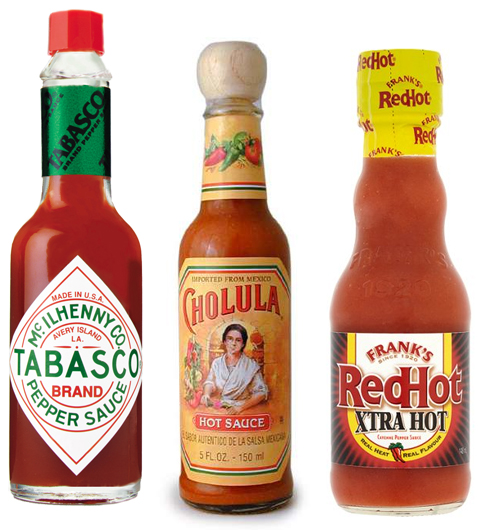
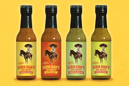
Outside of a select few leading brands like The McIlhenny Company’s TABASCO, Frank’s RedHot and Cholula, there isn’t that much consumer loyalty in the hot sauce category. While the swelling demographic of hot sauce enthusiasts are likely to have their favourite brands, it’s an area rife with consumer experimentation. That is quite unusual for an FMCG category.
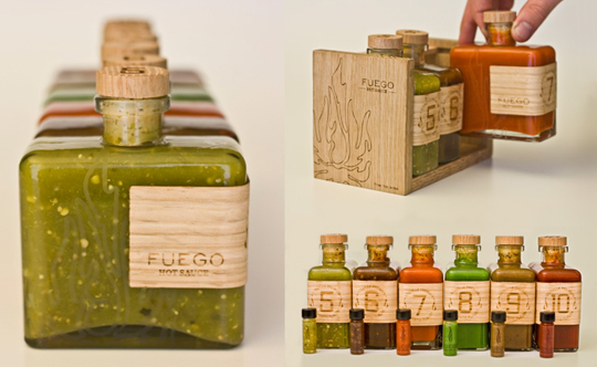
With so many supermarket shelves laden with minimalistic pack designs, the bright, noisy and eye catching pack designs of hot sauce brands stand out quite a bit. Nevertheless, we’ve found that amongst the endless number of brands that make up a rather hectic category, there are a number of design themes that are adhered to.
Craft
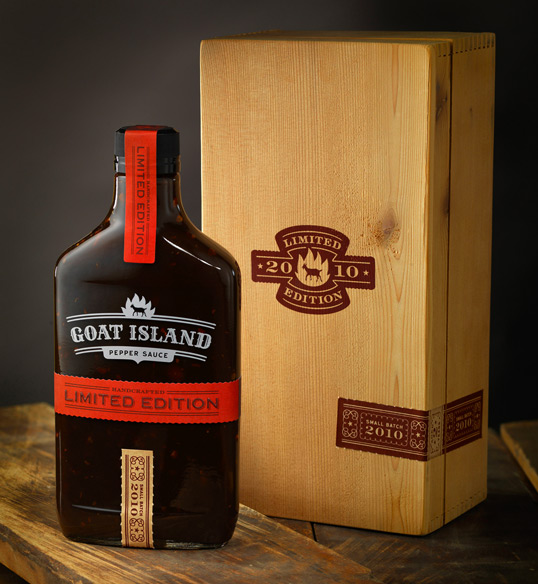
These designs are as simple as they come in the category but there’s still a fair amount going on. Craft design provides a small batch feel and offers consumers a special taste experience. The designs are rich in texture and colour bringing together a premium product.
The fiery pits of hell don’t exactly sound that pleasant do they? Well, they appear to be to consumers of hot sauce. For a target audience who like to feel they are fearless spice-seekers, what is more of a challenge than a battle against the very demons that haunt our kind?
Funny
Humour is a design aspect that is almost constant throughout the category. There’s not many things funnier than seeing your friend try a pepper or sauce that’s too hot and break into frantic sweats is there?
Authentic
When people think of spice, they often think of Mexico and generally of Hispanic nations. Mexico is famous for its spicy gourmet and head-exploding cayenne chilli peppers. There are a number of great designs that celebrate that, giving a true taste of Latin spice.

15 Devastatingly Beautiful Water Package Designs
In the competitive mineral water category, every brand is attempting to portray identical visual cues. They all seek to communicate purity, clarity, naturalness and refreshment. Water is water, after all. So the questions is, how do they stand out from one another if they are all saying the same thing? This is where structural and graphic packaging design’s role really comes to prominence. In order to make a splash in this category, brands need something bold, innovative or devastatingly beautiful.
Boxed Water Is Better
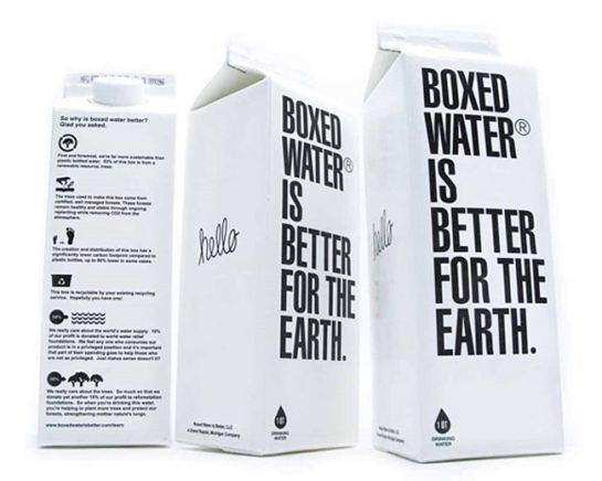
Bold typography and a black and white colour palette give striking standout to this sustainable water brand offering an environmentally friendly alterantive to plastic bottles. About 76% of the box is from a renewable resource, trees.
Beauty Water
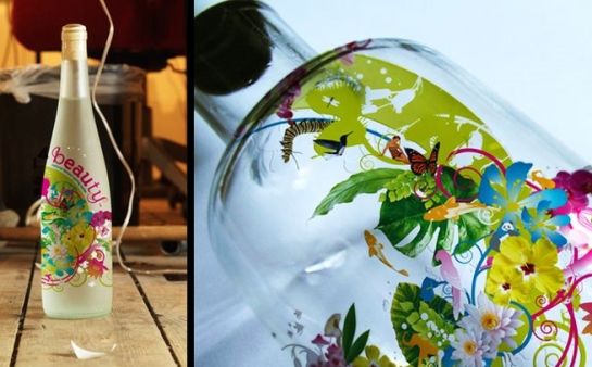
Beauty Water’s manufacturers claim that it can clear acne. We all know that water is good for the skin in general but that’s a ridiculous claim. Still, great pack.
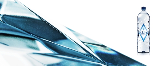
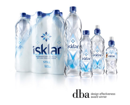
Isklar
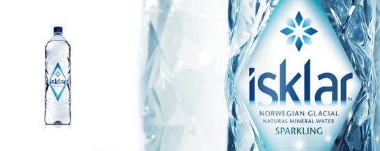
Bluemarlin-designed Isklar is a Norwegian Mineral water taken from the mountain glaciers of Hardanger, Norway. Inspiration for the design was taken from the source itself. Embedded with regional cues, it features an ice cool palette, an elegantly jagged brand marque and a faceted structure the mirrors the prism effect of glaciers. Going above and beyond pure aesthetics, highly complex structural considerations were required to construct the 147 facets of Isklar’s unique bottle.
Our design picked up gold at the 2009 Pentawards, the Grand Prix accolade at the 2008 Water Innovation Awards, and a silver trophy at the 2009 DBA Design Effectiveness Awards.
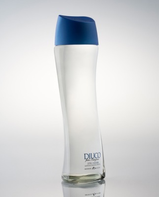
Diuco
Diuco, sourced from Patagonia, is a mineral water of high purity and higher design. The fluid structure combines the physical characteristics of water with an expression of natural purity. Nature is simple and unmuddled, so is this design. It even has its own mini-fridge to chill it to perfect tasting temperatue in 15 minutes.
Evian 2005 limited edition bottle
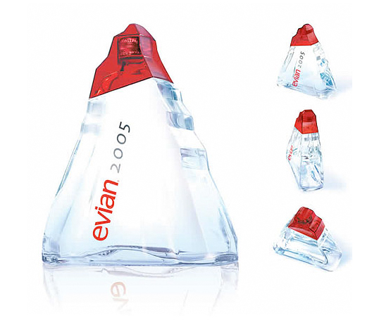 The limited edition bottle from one of the world’s most famous mineral water brands is called the “Origine” and is meant to conjure up the icy mountains from which Evian is sourced.
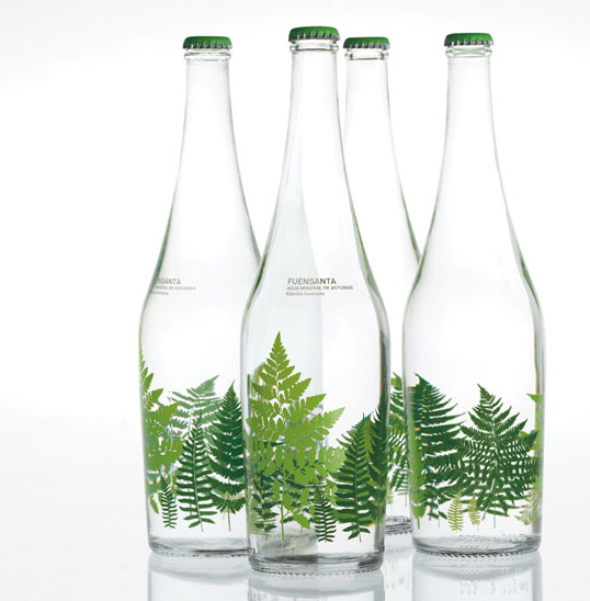
Fuensanta
This Spanish mineral water was created to for ‘chic’ retail locations. The graphic design is unlike anything else we’ve seen in the category. Glass bottles and high quality illustrations frame a premium brand with natural beginnings.
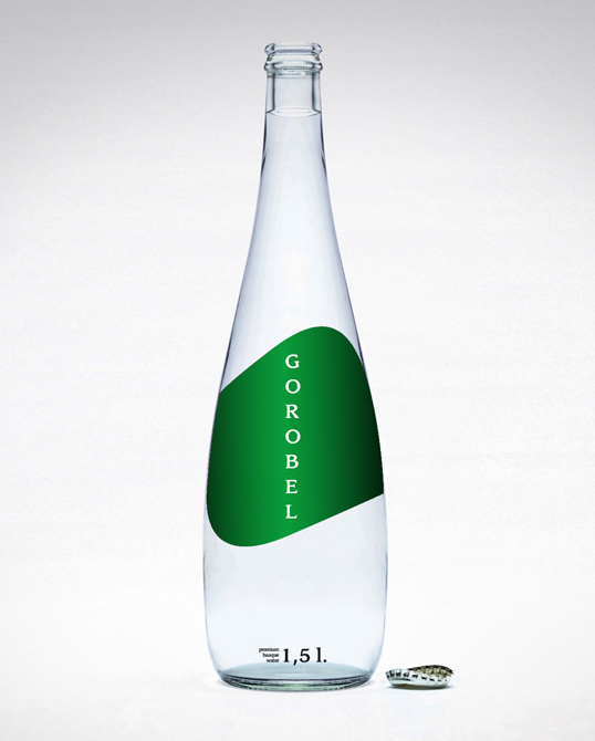
Gorobel
A sleek fluid holding shape makes a simple design for this premium Basque mineral water.
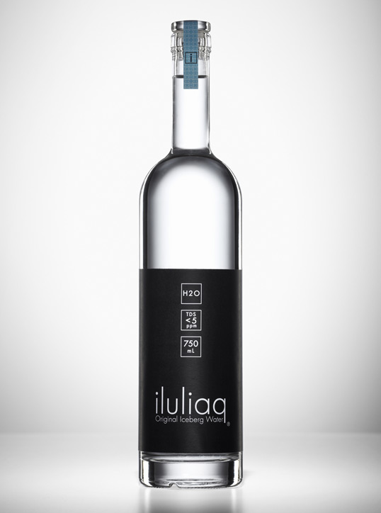
iluliaq
The sleek and measured design uses concise symmetrical squares to present information for a water collected from 100,000 year old icebergs that are ‘re-awakened’ in Greenland.
De L’aubier
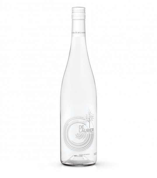 The graphic design for this French-Canadian maple water is simple and dynamic.
Luso water – LH2O
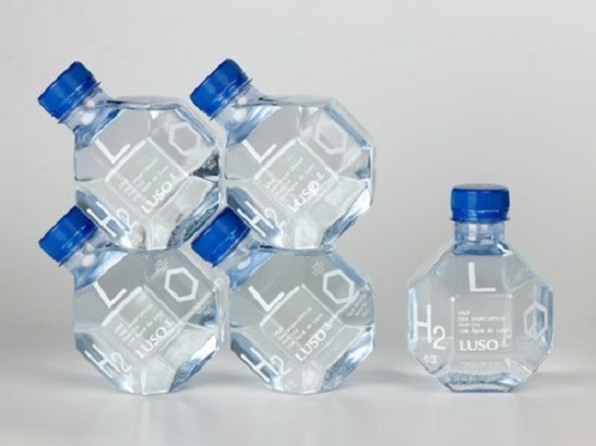 PET bottles that become eye-catching when stacked on shelf.
22 Penaclar
a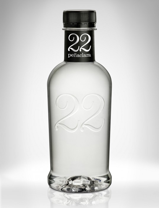
This brands name comes from the fact that its water flows at a constant 22 degrees celsius. The minimalistic design and elegant lettering bring together a truly premium design. Beautiful but perhaps too gin-like?
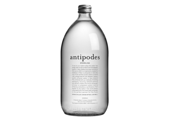
Antipodes
Antipodes is a premium New Zealand water brand with a pack design that does justice to the picturesque lanscape from which it’s sourced.
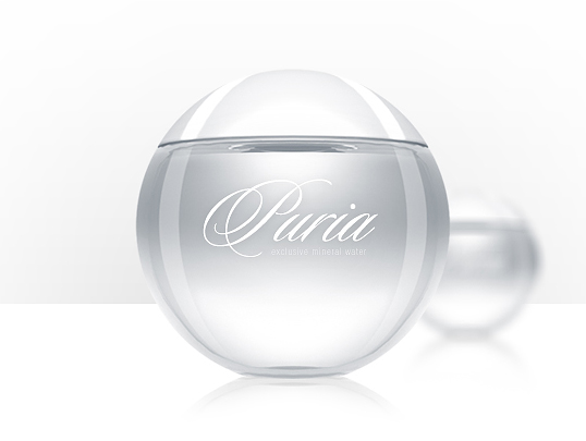
Puria
Puria’s structure takes the shape of a circle, nature’s own perfect shape.
Voss is a mineral water with a pack so attractive and ergonomic that thousands of consumers fill it back up with tap water to store in the fridge.
Evian limited edition by Issey Miyake
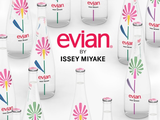 This feminine design celebrates the very source of life through colourful flower illustrations. Designer Issey Miyake follows in the footsteps of Jean Paul Gautier and Paul Smith, who have also designed limited edition bottles for the French brand.
The gender stereotypes that divide men and women have been rapidly shifting for decades. Women participate professionally in every sport, it’s common for men to go on paternity leave as well as wax their chests and spend significant sums on cosmetics. Though the likes of Nivea and Gillette dominate the swelling male grooming category, there are a host of smaller luxury brands with packaging is too beautiful to sit on the supermarket shelf.
Capitalising on the current trend for all things vintage, many of these brands use traditional typography, bold simple lines, a rustic colour palette to create stunning packaging designs that thrust them to the summit of the premium and luxury male grooming segment.

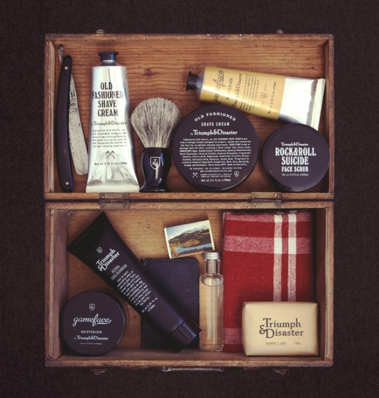 The designs feel very bespoke. They reflect romantic connotations of traditional barbers, the unassuming talent of those that work in them, and the sophisticated, sexy, yet masculine image one sports after a visit.

 This male grooming range from Harry’s provides a minimalistic contemporary twist on the traditional barber’s range. The lines, colours and typography reflect the handsome and neat appearance consumers can aspire to.
 It’s this kind of gear that helps Don Draper seduce so many beautiful women and think up such effective advertising campaigns isn’t it?
  This collection isn’t exactly male specific but it is a great example of the vintage barbershop aesthetic in action.
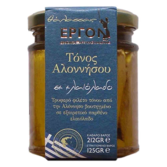
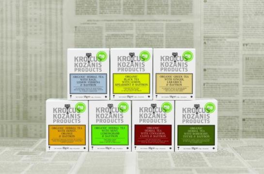
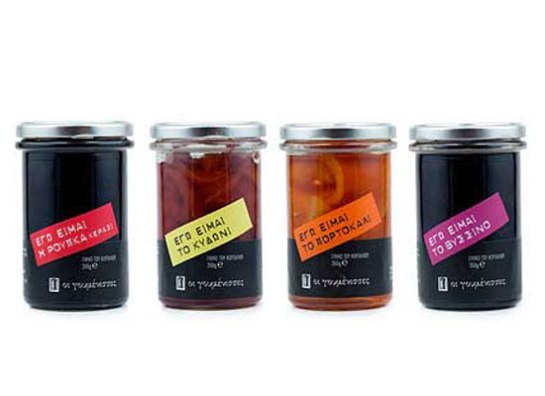
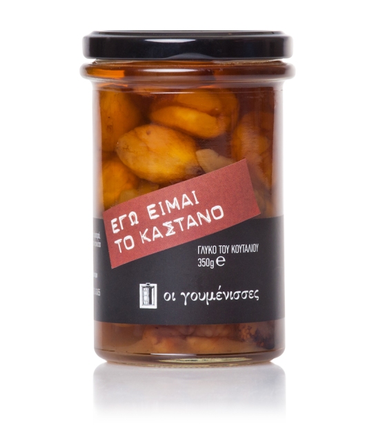
7 Greek Packs Designed by the Gods
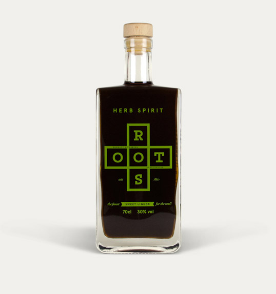
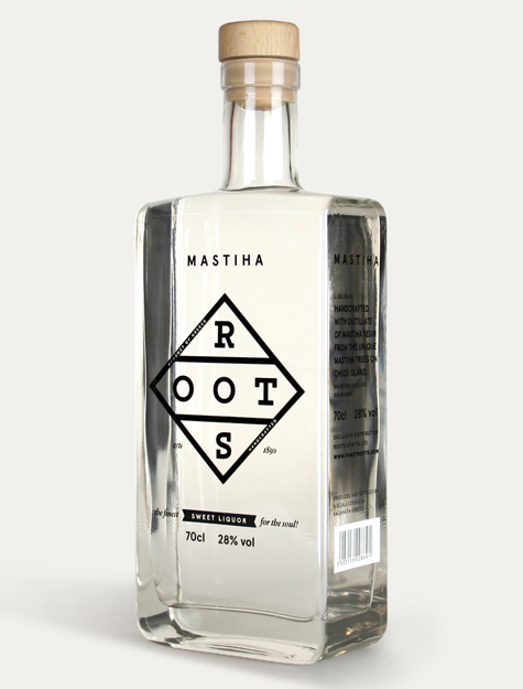
On a recent trip to Greece we took some time to perform a little audit of the local packaging design. It’s unsurprisingly grey and wet in London at the time of writing so here’s to hoping that these Greek packs bring some Mediterranean sunshine to England’s September gloom.
6 Package Designs Inspired by Science
For FMCG brands to broadcast the science behind their products is nothing new. Such tactics dominate packaging design in pharmaceutical, personal care and OTC categories, and understandably so! They contain products that count their clinically proven objective ability to perform certain tasks as their sole offer to consumers. But it would appear that their design tactics have begun to spread to other categories.
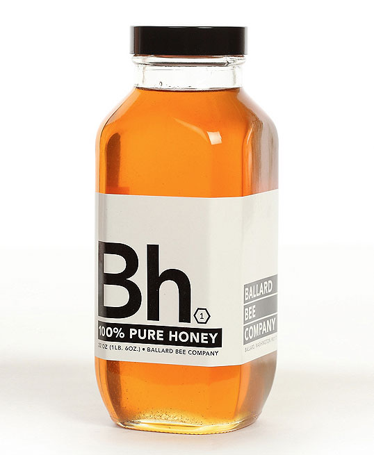
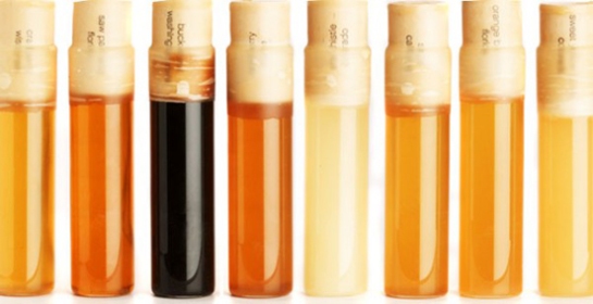
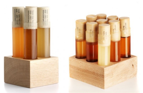
There are a handful of craft alcohol and honey brands using packaging that looks like it has literally been re-appropriated from a laboratory. Maybe quite disturbing to some but what they are going for is to show that there is careful scientific process that goes into creating the perfect product. The two featured honey brands use the imagery and terms of science to show that their products are 100% natural and buzzing with sweet deliciousness.
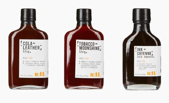
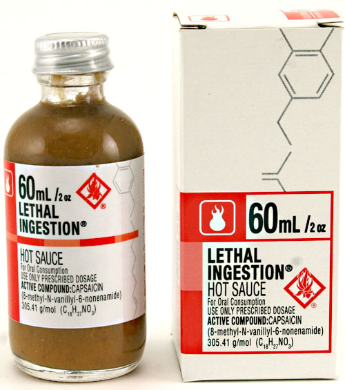
Hot sauce FMCG packs don’t come with more scientific designs than this hot sauce has. This product probably couldn’t look less appealing to most consumers if it tried, but then again that’s not who its targeting. The hot sauce enthusiasts who’d buy this are all about challenges and finding the mouth-burning, head-exploding mecca of their beloved category.
Pet accessories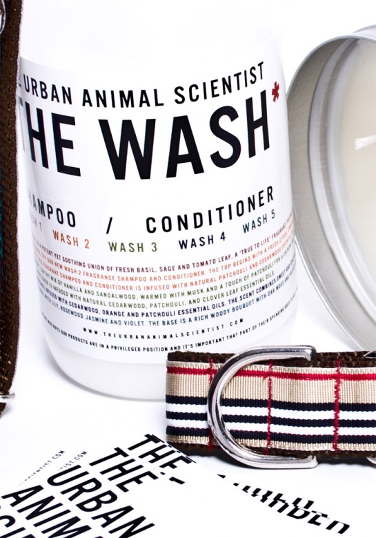
 Dog and lifestyle accessories brand The Urban Animal Scientist has put science at the very heart of itself. From its name through to its authoritarian colour palate, this brand is certainly taking a rather tongue-in-cheek and playful approach to including science in its proposition.
6 Delectable Olive Oil Brands
A few weeks back we posted a gallery of honey packaging. Olive oil, much like honey, stands out to us a category which is particularly populated with beautiful packaging design.
Razatusa
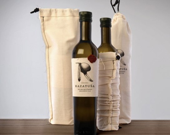
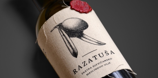
This Croatian Olive Oil is named after the region from which it originates. Though the design is slightly rough and simple, it makes gives the product a rustic, authentic and ultimately premium appearance. The label doesn’t just have aesthetic benefits. It also soaks up any dripping oil from above, keeping it from the table, and is easily slid on the bottle by hand by the family that produce it.
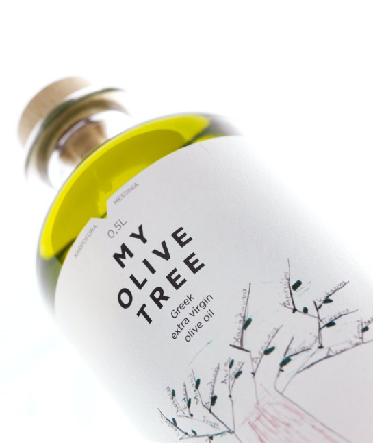
My Olive Tree
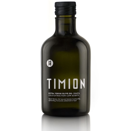
This extra virgin olive oil produced by 5 generations of the Lambropoulos family in Greece celebrates its rich heritage through simple premium design. The branches of the trees they plant for their olives become the lines that connect their extensive family tree.
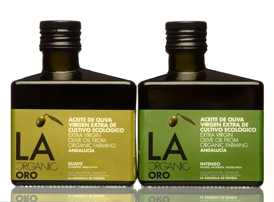
LA Organic
LA Organic oil’s packaging combines minimalistic design with a structure like no other in the category.
Brachia
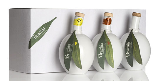 This design for Brachia olive oil is particularly stunning. The bold structure reflects the shape of an olive fruit with product information on the leaf-like tag and a spout representing the olive branch.
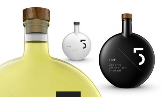
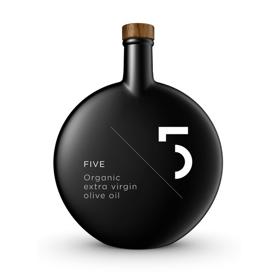
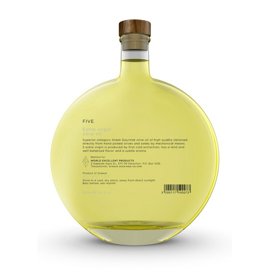
5
The structure for Greek oil ‘5’ is another bold standout in the category. The smooth shape is deliciously enticing although it does look a bit like a celebrity fragrance!
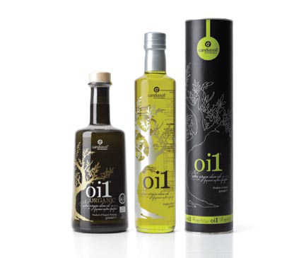
Oi1 Organic
This Greek oil produced by George Tsikandilalkis and family from the isle of Crete showcases an elegant design, fitting for a history in the olive oil business spanning hundreds of years.
Are there any other olive oils out there you’d like to see in this gallery? Let us know.
7 Brilliant Bread Packs Fresh Out of the Oven
Packaging for the baker’s staple and one of the world’s most eaten foods has always been very standardised. Up ’til now that is. As competition has hotted up in the category and supermarkets are stealing customers from their bakery rivals, packaging has become an avenue that bread and baked goods brands are exploring to make sure they don’t get left in the oven.
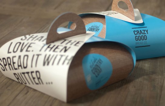
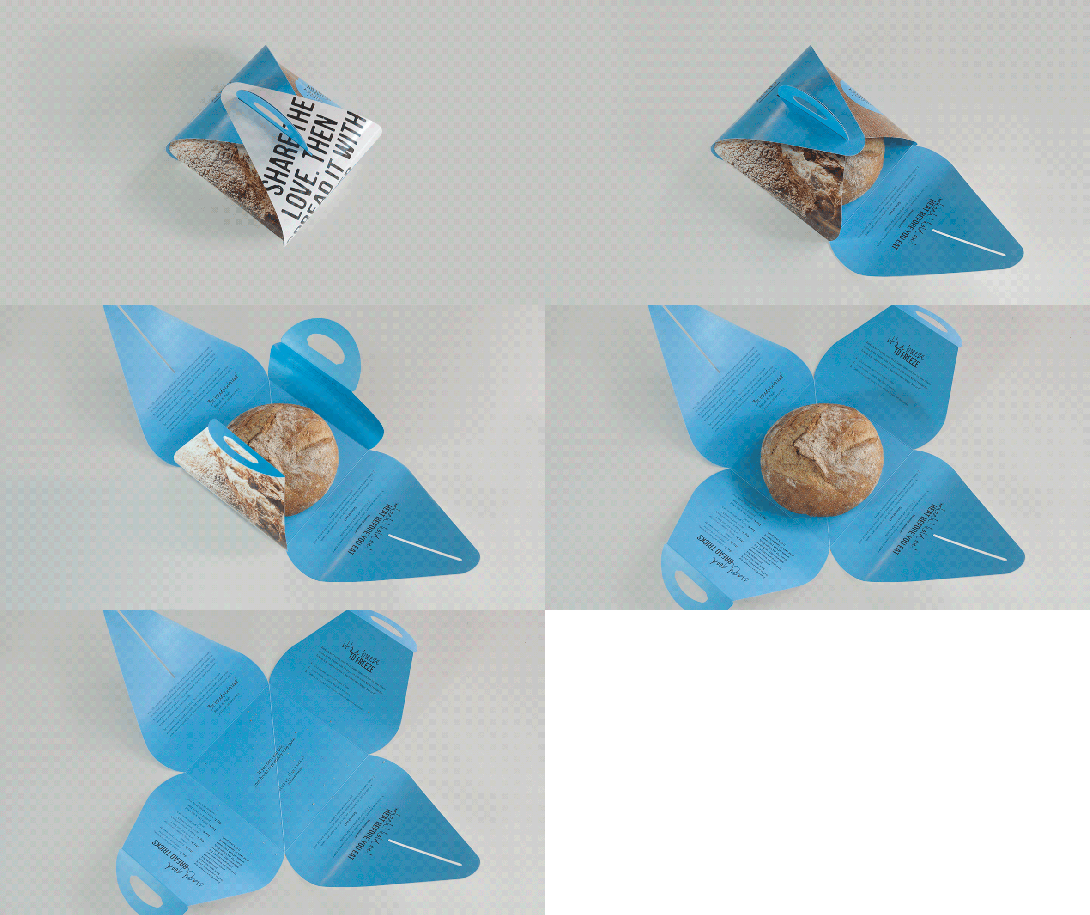
Crazy Good Bread co
Just saw this design on the Dieline and had to add it to this trend post. This du pain which is retailed at Santa Barbara’s Public Market, and with shipments of love sent across the country is blessed with a wonderful package design. A playful approach to structure, warm colours and graphics and clever copy make this a triple threat design!
Tritcum
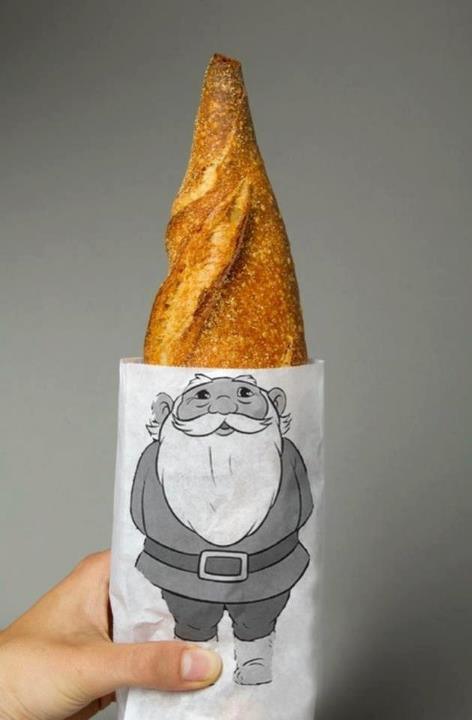
Spanish baker Xevi Ramon packages his baked produce like no one else. With a simple, range consistent design and bold typography, the brand he’s built through his packs is confident, high quality and looking at the gnome sleeved baguette, humorous too.
Whole Foods 365

Whole Food’s 365 bread range deserves its place in this post. It utilises Whole Food’s signature colour palate to clearly signpost differing variants. Symmetrical illustrations echo Whole Food’s natural, healthy and organic offering and also distinguish the bread type.
Maison De L’Huller
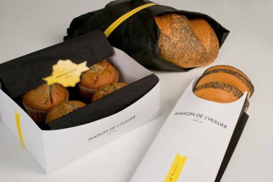 Maison De L’Hullier is another local bakery that has stepped up its game via packaging design. These designs are simple, chique and celebrate the craftsmanship of their maker.
Raw Health Vibrant Living
Geometric shapes and a calming colour palate frame RAW Health’s high quality breads. Transparent windows reflecting the brand’s word marque offer a glimpse of the luscious seed-filled product within. The unusual cardboard pouch is similar to what you’d buy sweets or popcorn in, selling this bread as a real treat itself.
Euphorium Bakery
Eurphorium bakery’s products won’t be ignored with their text heavy pack designs. The words play such a huge role in the packaging that they illustrate the bold, fresh, confident tastes of the bread. It’s all about freshness for euphorium.
Fit Buns protein bread & Kohberg

 This pair of designs prove that bread isn’t all about expressing the premium nature of a brand. With humour as the goal these packs, cheesy as they may be, will catch every shopper’s attention. The later pack from Denmark’s biggest bread producer Kohberg, is a special edition to raise money for the Danish Cancer Society.
Bread,
you rise
from flour,
water
and fire.
Dense or light,
flattened or round,
you duplicate
the mother’s
rounded womb,
and earth’s
twice-yearly
swelling.
How simple
you are, bread,
and how profound!
– Verse taken from ‘Ode To Bread’ by Pablo Neruda.
6 Picture Perfect Packages Featuring Real Life Photography
We’re used to seeing photography on packaging: appealing food on food packs, leaping cats and dogs on pet food bags, fruit on our juice cartons, and healthy post-consumption or unhealthy pre-consumption folk on OTC packs.
A select few brands are starting to think beyond these parameters and are expanding the scope of the photography they use on their packaging. By using photography these brand’s are able show consumers their personalities with substantial depth.
Looking at the packs we’ve found that fit into this trend, there seems to be a common theme in celebrating the people and places behind brands. The lines on a face, the intricacies of an eye, or a picturesque scene tell stories that consumers can really identify with. It’s with this identification that brands can build connections and associations with us as well as stand out in busy premium categories.
Matsu Wines
This wine from organic winery from the Toro D.O in Spain showcases 3 photographic portraits depicting three generations that devote their lives to the field. The personality of each wine is reflected in each man’s character and expression.
Boyd’s Coffee
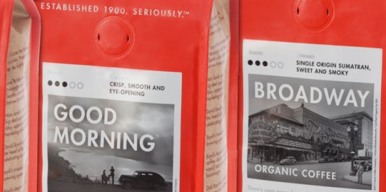
Boyd’s Coffee is one of the oldest family owned coffee companies in the world. It features black and white photography on its packs to communicate its heritage and origins in 1900 in Portland, Oregon. The images either reflect Boyd’s own history such as the original location at 423 ½ SW Morrison or iconic Oregon images including the historic Columbia River Gorge Highway, the Broadway Theater and the Streamliner train.
MInima Moralia Wines
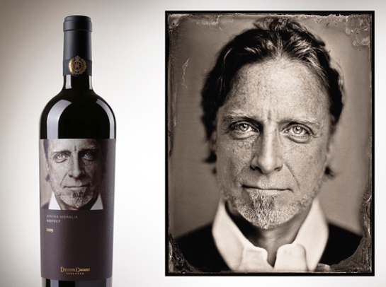
Six special labels were created for this wine range, one to represent each of honor, respect, devotion, hope, gratitude and honesty. The idea is that people’s faces, like wine, are incredibly detailed truth filled objects, design with intricacies aplenty.
Belice Oil
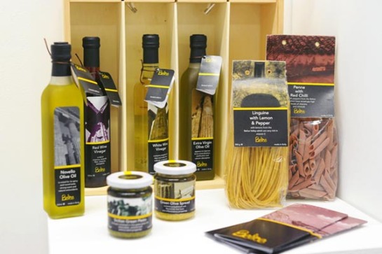
Much like Boyd’s coffee, this organic Sicilian olive oil and food range from Belice depicts its homegrown identity, authentic taste and production with black and white or grainy photography of the wonderful Italian island from which it originates.
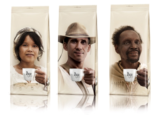
Coffee is something that so many of us all around the world take pleasure in on a daily basis. These pack designs from Peeze Coffee remind us of the human story behind what we drink. Those photographed on pack are the farmers responsible for the agricultural production of each blend. Both a heart warming and ethically minded design.
Via Roma
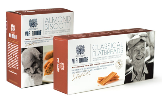
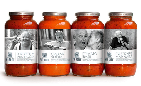
The photographs on these packs from Via Roma celebrate the unique personalities of the 3 million people who live in the Italian region of Tuscany. The designs pulls in associations with its origins as well as the Italian people who inspired its recipes, in a country which takes cooking and its food very seriously.
9 Package Designs for Honey Lovers
Winnie the Pooh’s used to eating his favourite food straight from its source. What would Winnie say if he saw the extravagant vessels into which brands are placing their honey for us to buy?
With a flurry of great pack designs launching recently, the sweet bee-produced nectar has certainly captured the imagination of entrepreneurs and designers alike. Honey packaging has become a platform for some of the most inventive and creative design in the FMCG category.
 Rustic and traditional, the above design from Klein Constantia Farm mixes classic appeal with a real element of fun.
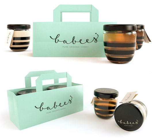 Many of the designs are simplistic. They pay homage to the traditional jar format for honey adding minimal yet bold graphics to drive home the product’s natural state.

 Science also stands out as a popular design theme. What better way to bear testament to the purity of honey than with scientific approval? The raw, bold simplicity of periodic symbols

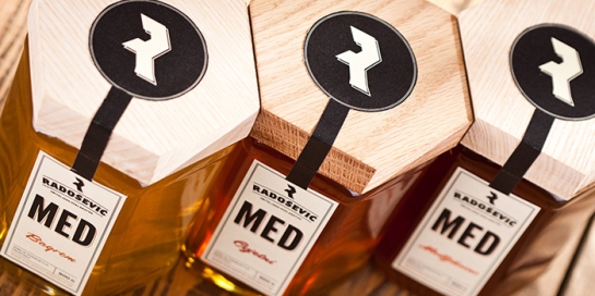
 Though almost all design uses a transparent pack to represent show the natural nectar within, several brands use a unique structure inspired by a beehive or honeycomb.
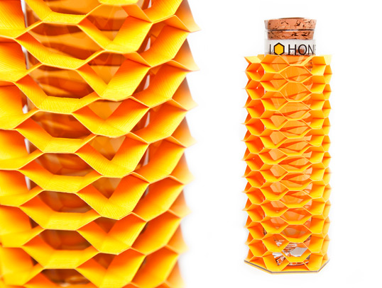
 Ultimately, the overriding trend in this category is one for premium design. This is found in a contemporary way through bold shapes and typography, as well as by showcasing the fact that the honey is taken straight from the source. Whether it be by means of science or nature, the result is a natural product that looks fantastic on shelf.
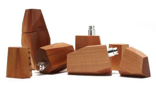
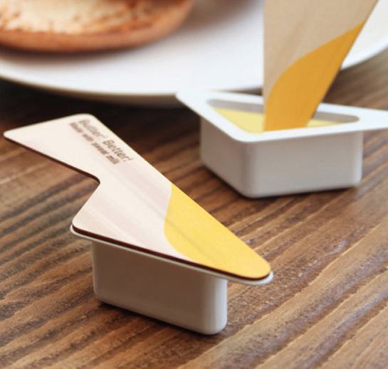
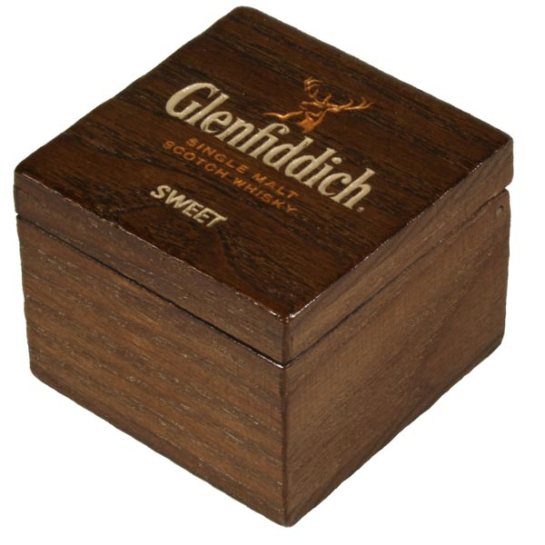
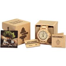
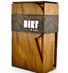
In packaging design, wood has become synonymous with premium. A natural texture with endless crafting possibilities, wood is a symbol of heritage, authenticity, provenance and quality – key attributes that brands are fighting to reflect.
Not only is it recyclable and eco-friendly, but an infinite canvas for great graphic and structural design explorations. It’s perfect for many brand’s special edition products.
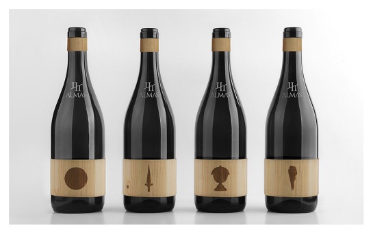 A product’s label is a canvas where sensorial design and exquisit crafting can meet.
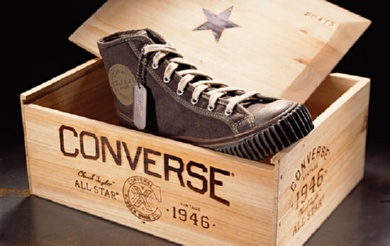
Used for centuries as the core material for goods transportation, wood is still used for this function today.
9 Transparent Pack Designs That Put it All on Show
As part of a recent trend for simplicity, big name brands like Starbucks and Nivea have modernised by undressing their identities in favour of minimalist persona. Other brands have read the same mantra but are taking it further and reflecting it in their pack design, removing extra layers of material and various design elements, to welcome a wider array of transparency on pack.
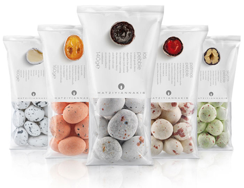
Hatziyiannakis Dragee Pebbles’ packaging demonstrates the manufacturer’s pride in its products. The pack gets away with being relatively light on text as it’s so brilliantly heavy on imagery.
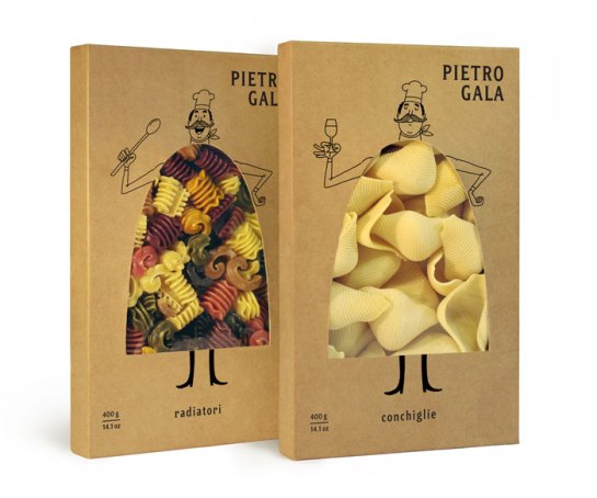
Complementing the naturalness of the Pietro Gala brand is its cardboard packaging. The quirky yet humorous product reveal really got our attention.
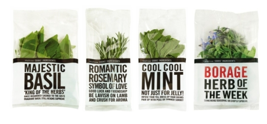
Waitrose own Herb range stands its ground against any premium one. These classy designs are combined with bold typography giving clear product signposting. Herbal cooking inspiration has never been as easy and fun.
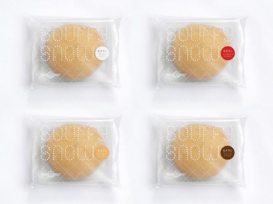
The little souffle-like cake, Souffy Snow, is just as sweet and delicious as its completely transparent packaging sugests.
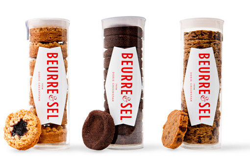
Handcrafted with care and love, the Beurre & Sel biscuits don’t need a complicated pack design. Its unique story is enough (read it here).
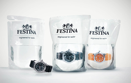
Festina use transparent packaging to show complete confidence and satisfaction in their product. These waterproof time pieces prove themselves on shelf and won’t fail to catch your attention.
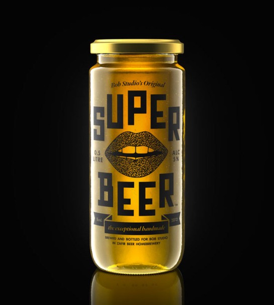
Bob Studio’s beer, served in a jar, is definitely one of a kind. As if the unusual pack format wasn’t enough to catch our eye, it’s also see through.
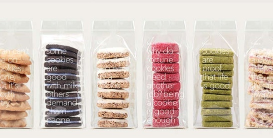
For Fruute, the packaging is only a cover, as the products speak for themselves. The packs look great but do you think these cookies would make it home from the store without crumbling?
One thing is clear: a brand that has the courage to expose itself as it is, speaks complete confidence in its product. Transparent packs not only drive brands to play more with the product itself, but also have the power to innovate in markets that are too ‘crowded’ with the same old shapes and colours.
5 Brands Personified by Packaging
These brands have found ways to showcase their product either as a part of a character or as an element in the actions of a character. Such personifications give brands the opportunity to quite literally show consumers who they are. A representation involving our own form is one with which we can immediately identify.
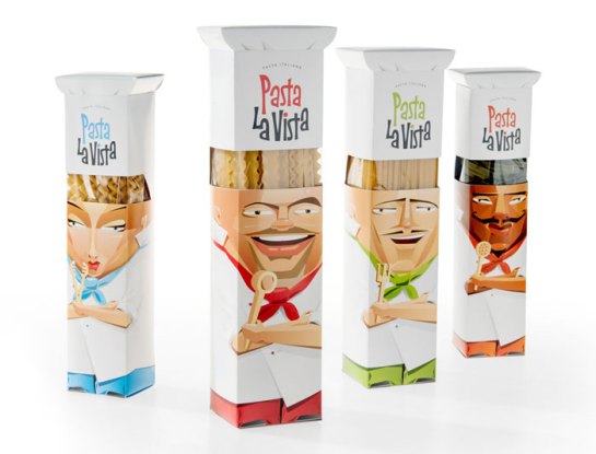 Different types of pasta form the hairstyles of four Italian chefs, each unique in their culinary expertise as well as their appearance and expression.
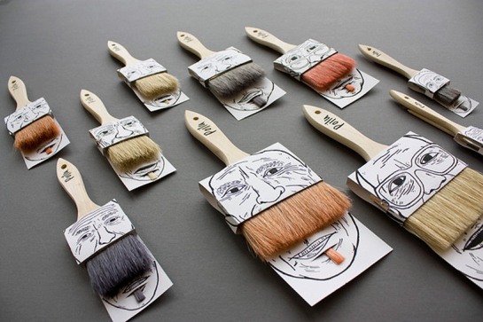 These moustache paintbrush pack designs by French-Canadian designer Simon Laliberté are hysterical.
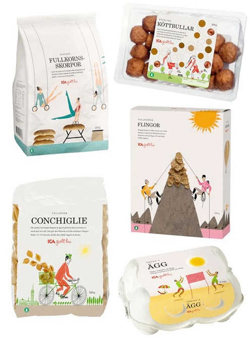 The pack designs from Swedish food brand ICA Gott liv show their products in graphics depicting characters enjoying active and healthy lifestyles.
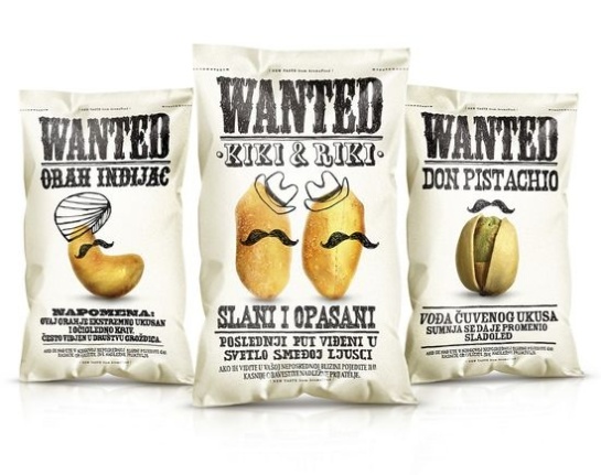 These Serbian nuts take imagery from WANTED posters that we mostly associate with the notorious outlaws of the wild west. Cashew nut (left) translates in Serbian as Indian nut, that would explain the turban then.
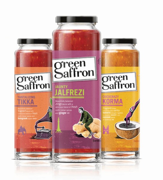 One of our own to finish. We’ve had brilliant feedback for our pack designs for spice specialist Green Saffron. On pack graphics illustrate the element of fun in the brand and the peculiar scenes depicted are representative of Green Saffron’s unique ingredient combinations. You can find out more about our design for Green Saffron here.
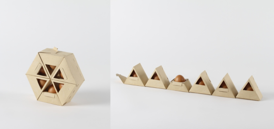
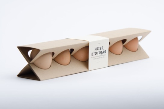
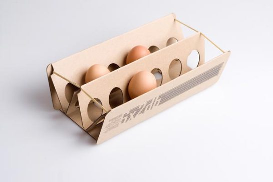
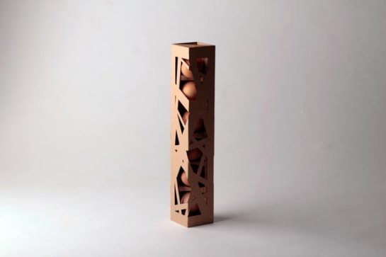
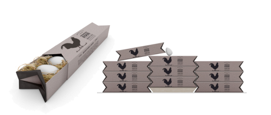
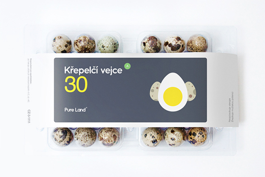
14 Eggstatic Designs For Easter 2013
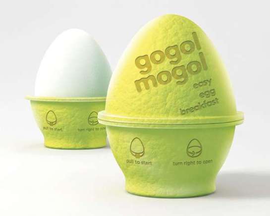
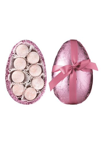
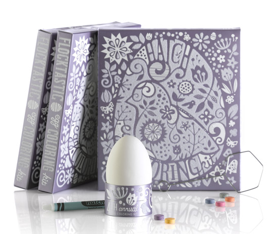
We’ve reached the Easter holiday period and this year our eggs are evolving. Traditional formats of the egg (both the hen laid and chocolate Easter variety), are being redesigned and rethought by creative minds in the design industry.
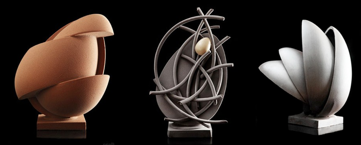
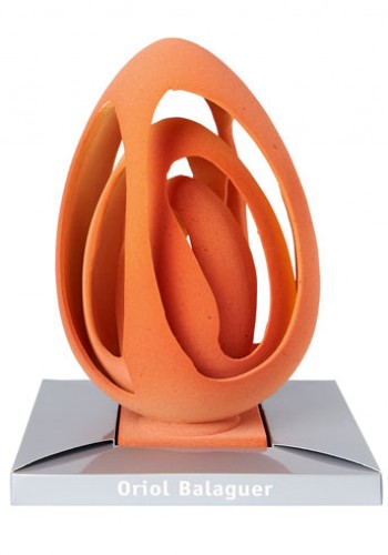
These eggs from Spanish chocolatier Oriol Balaguer’s contemporary art inspired demonstrate spectacular use form in Easter egg design. They show that any shape or object (edible or otherwise), however regular or seemingly determined can be re-imagined into something beautiful.
This year’s fashion colour palette brings bright, neon colours as well as delicate, pale ones to packaging design.
Sustainable packaging remains an area of continuous innovation. These designs demonstrate the structural flexibility of cardboard that can result in beautiful design that’s fully recyclable.
Simplicity will never die, in fact more and more brands are falling in love with clean lines executed alongside standout typography.
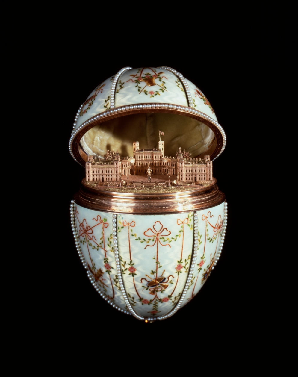
As for the shape of the egg itself it’s predetermined by definition. In the image above Fabergé demonstrate that it’s not just by packaging design that we can innovate egg shapes but also from within.
Why has Bacon Packaging Been Left Behind?
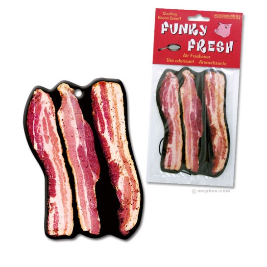
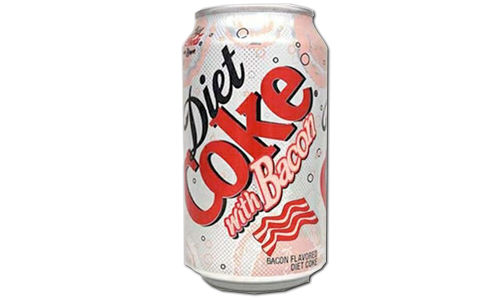
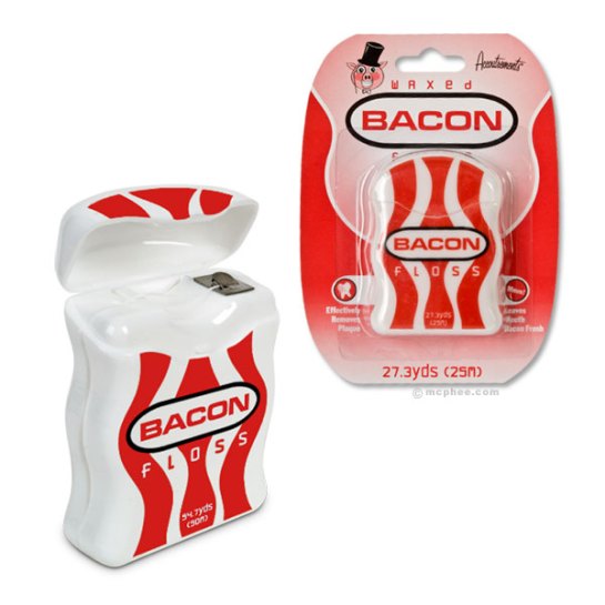
 We admit that it’s a weird one but it would appear that bacon has become trendy. Bacon has recently gained a huge amount of popularity in the United States and the fatty treat trend is now spreading to Europe and beyond.
Rashers are no longer the only way we can get your bacon fix, everything from bacon air freshener to bacon dental floss and Bacon Diet Coke is available.
Click here to see to see the top 10 weirdest bacon products.
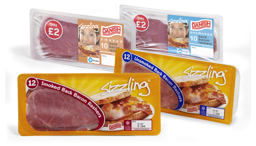
We’ve noticed however, that despite the quite frankly insane bacon trend, bacon packaging hasn’t changed a bit. What’s the deal there? Why aren’t bacon brands capitalising on the popularity of their product with some innovative, unique pack designs?
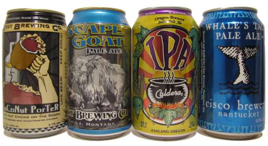
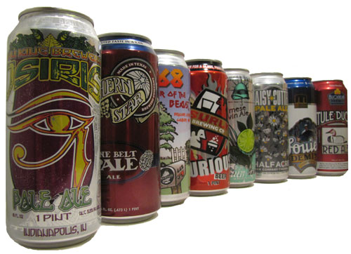
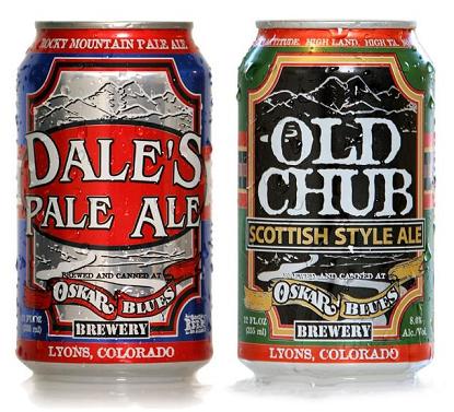
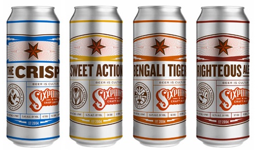
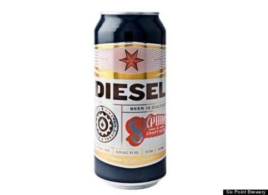
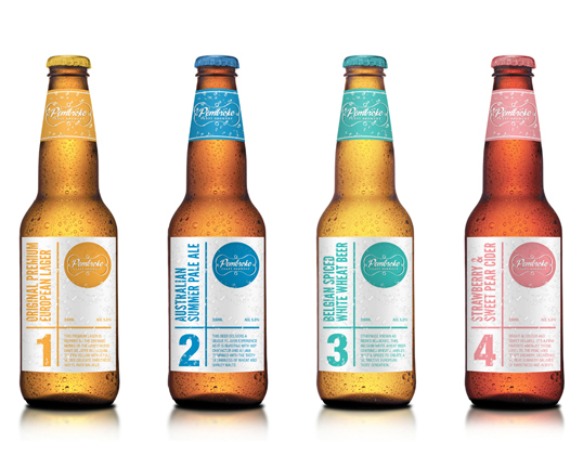
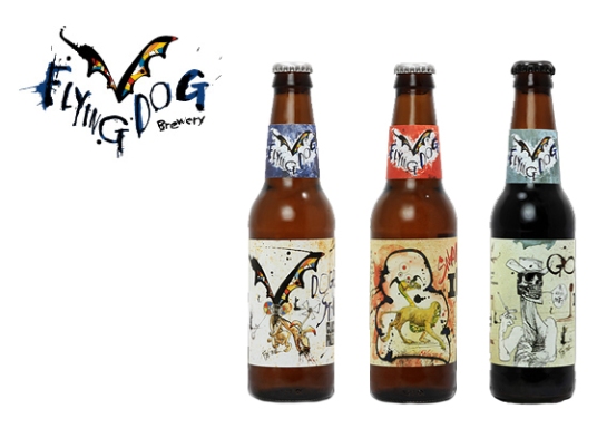
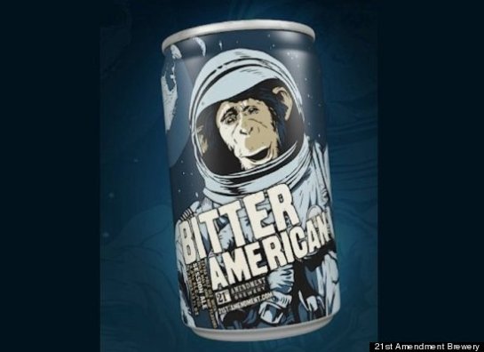
The Craft is in the Can
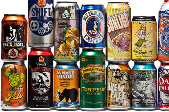
We’re major fans of craft beer and some of the graphics and illustration produced to brand it is outstanding. Last year we wrote a post about trends in craft beer packaging (read it here.) Originally craft beers were mostly bottled, but it would now appear that the can is the new pack of choice for crafters.
Most of us would always choose a bottle of a can given the choice but it should be pointed out that, with the way cans are today, they are a perfectly discernable drinking choice. Cans used to poison your drink with a metallic taste but now, due to a water-based polymer lining, the liquid inside doesn’t even touch the metal outer. We should also add that cans won’t let light or oxygen in like glass to damage the liquid, they won’t smash when dropped, can be stacked for storage or chilling, take up less space and are more recyclable than bottles.
It looks like cans may be the future packaging platform for craft beer, watch this space!
[via Perfect Pint]
5 Package Designs with Synergetic Brandmarks
Building equity through synergistic brandmarks and pack or product structures appears to be a successful tactic for brands in their increasingly competitive categories. By finding elements of consistency throughout design from brand to pack and product, there’s opportunity for brands to tell consumers their story through simple on shelf interaction.
So which brands are playing the synergy card and playing it well?
Isklar – We often beging our packaging trends with a design of our own and aptly this one was a Design Effectiveness Award winner fro Blue Marlin. When we worked on Norwegian glacial mineral water brand Iskar we repeated the shape of the diamond shaped logo to provide structural shelf stand out.
Nivea – The worldwide cosmetic and personal care brand have recently released their new face care packaging with a new brand identity inspired by the iconic blue, which holds Nivea Crème.
P’tit Louis – Not long after launching in the 90s, P’tit Louis changed its generic shaped brand mark to a round green mark echoing the product within.
Whiskas – Whiskas Temptations’ structural packaging is directly linked with the brand’s identity. The kitty’s head shape is used as a visual in the brand mark and also as the shape for the box.
Dewars White label – The tail of the D was designed into the glass bottle as a debossed area.
If you can think of any more packaging examples we could’ve included we’d love to hear them.
It’s St. Patrick’s Day on Sunday (17th) and given the theme, we’re taking a look at some great green packaging. Happy St. Paddy’s weekend!
9 Red Nose Designs Guaranteed to Raise a Smile
For 25 years, Comic Relief’s Red Nose Day has been raising money to give a shelter to young people on the streets of the UK and, at the same time, to fight malaria and provide fresh water and vital vaccinations in Africa. Red Nose Day brings together brands, celebrities and members of the public, as a team of Fun Raisers for the 15th of March – the official event date.
British Airways is flying high with its fun raising idea, an 80s themed ‘gig in the sky’. Not only did they rock in the air at 43,000ft, but unsurprisingly, smashed the World Record for the ‘World’s Highest Concert’ and ‘World’s Highest Harlem Shake.’
PEZ designed special ‘Dinosesaur’ dispensers to sweeten up Dinomite, Triceytops and T-Spex.

Lulu Guinness’ signature style unmistakably adorns her limited edition Red Nose Day bags.
Damien Hirst’s already iconic skull got a Red Nose fix as well, shinning bright like a diamond.
Even Mickey Mouse sprinkles some magic for a noble cause.

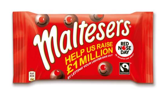
Maltesers have joined in with a special edition pack. For every one of these bags of sweetness sold 3p will be donated to Comic Relief.
Emma Bridgewater’s Comic Relief homeware will surely pave the way to a stylish kitchen.
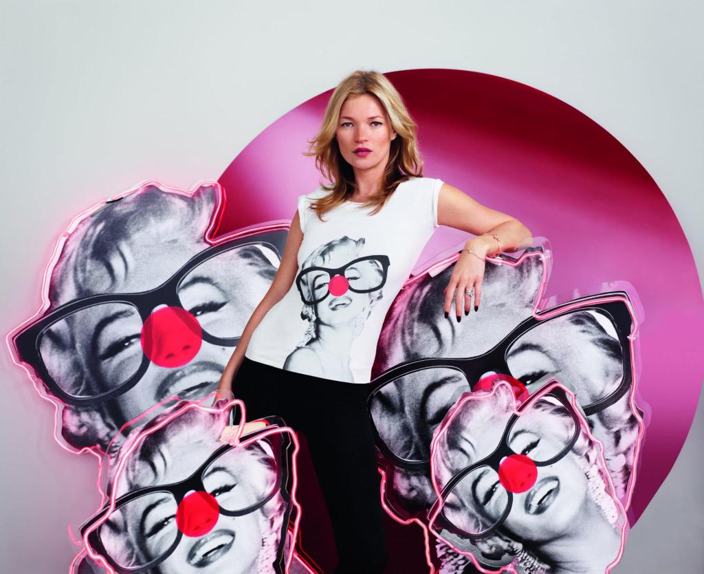
Stella McCartney designed a t-shirt range which have since been adorned by a host of stars in support. Below Kate Moss sports McCartney’s Marilyn Monroe design.
UNDRESSING PREMIUM PACKAGING
‘Premium’ is and always has been a relative term. Defining it as a concept can’t be anchored in a single set of cues applicable to all. Each product category has built its own cluster of premium elements over time, but even those are subject to change. Broadly speaking, each category has contemporary and traditional standards of premium. Inevitably these polar platforms infuse, leading to brand, product and packaging innovation.
Often the first element to speak about the product, typeface plays an imperative role in all pack design. As consumers, we’re bombarded with brands and have become experts at judging books by their covers. Heavy lettering will always have its crown as the king of brand heritage, but on the other hand, the elegance simple lines can reflect, is unbeatable.

Texture can be that little detail that makes the difference, enchanting us when we have nearly made our judgements. If you can’t help but pick it up, let’s face it, it’s ending up in the basket.
Shape gives poise to the brand, transforming it into an object of desire and encapsulating its other elements in one centrepiece. This is the area of, not just premium pack design, but of pack design in general, that brands must continue to explore.
Neon green, pure black, a whole host of bursting colours, it’s not only gold or silver that proclaim high-end credentials anymore.
Like an invitation, meant to delight and intrigue, imagery is the gateway to new brand experiences. It not only gives brands opportunity to show complete confidence in their products, but can get consumers salivating.
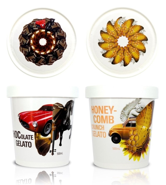
Less is more they say but there are occasions of course, when more can be more. Patterns and graphic elements have become a seal of premium, transcending the test of time and becoming an element of ‘modern’ instead of ‘traditional’.
It’s clearly not all about cool colours and sophisticated golden typography. Premium packaging needs to embody a brand’s confidence, authenticity and sense of quality. It should engage us in a way its competitors don’t, making the brand it represents a discerning choice, because it’s uncommon.
5 Boxed Up Brands
Oh, the age of convenience. Armed with smart phones, everything is available at our fingertips. In world where everything is on demand, it’s more important than ever for brands to work within the constraints of our busy lives. Some have found a way to accomplish this by boxing up comfort, convenience, positivity with an element of surprise and sending it right to our doors.
 Just look at Graze: it’s nature on your doorstep every week. They’re showing off health’s pleasurable side by replacing the average crisps and other unhealthy snacks with fresh and delicious nibble mixes to tickle your tongue: fruits, walnuts, dips & dippers, flapjacks and some lovely others. Variety is their hero.
 For those that love to cook their meals from scratch Abel & Cole came up with the idea of providing a recyclable box (on a weekly basis) filled with the freshest of organic veggies and fruit in the UK. And don’t worry if inspiration fails you one day, as you’ll find a list of the best recipes with the ingredients required all in the box.
 With Chefday, New Yorker’s can go pro in their kitchens at home. Make your selection of the chef-designed recipes and you’ll receive all the pre-measured ingredients (even down to the tiny pinch of salt). A video will guide you throughout the ‘process’ and at the end you’ll get to enjoy your masterpiece with the specially selected Chefday Spotify music to compliment the food. The companies good service continues, as for each Chefday recipe sold, a meal goes to a New York family in need.
In a different category but based on the same principle, GlossyBox picks 5 high-end brand products for the beauty lovers to experience and enjoy and sends you them once a month.
Here’s one for the ladies – Le Parcel is the must have monthly tampon subscription. Gone are those panic moments and the late night runs to the drugstore. The Parcel box is discreet and comes in lovely colours to brighten a lady’s sensitive days, right on time and always surprising with a tiny pack of chocolates and a small gift.
PACKAGING INTRIGUE
Brands have to make a good first impression just like we do. Often we are immediately judged on aesthetic appearance – a clean shave or pungent cologne can do the trick. For brands it’s packaging that plays the same, incredibly important role.
We’ve found the brands using packaging, not just to make a good first impression, but an exceptional one. These packs are designed to intrigue, to pique our curiosity, tell us a story and stay in our minds.
This special edition pack for Bombay Sapphire gin keeps a secret as it sits on shelf. When picked up a mechanical switch is hit illuminating the pack in an 18 second display. The current running through the electroluminescent ink is powered by a small battery at the bottom of the pack.
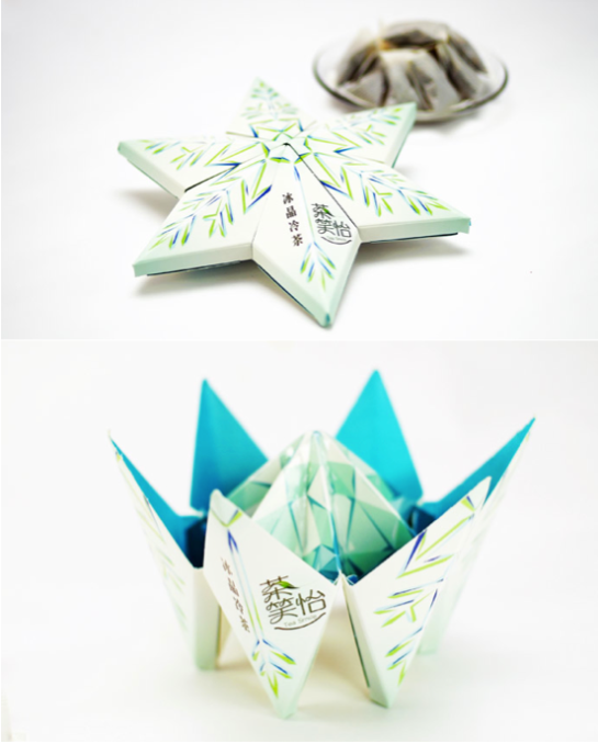
 Tea Smile’s angular form and frosty colour palate make a sip of their ice tea a perfectly refreshing tonic for a hot summer’s day. Watch in amazement as the pack transforms from snowflake to iceberg before your eyes.
 Hidden in a labyrinth pattern, the Mysterium brand name remains secret until put under a UV light. In an attempt to find appeal in nightclub and bar settings, Mysterium’s design breaks away from the stereotypical graphics usually found in the wine category.
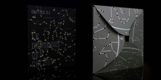
 An elegant black canvas hides the story within. What might seem like randomness during the day only makes sense at night when various dots and lines reveal our constellations on this limited edition Olivier NJ album cover.
 This design for Snoop Dogg’s/Snoop Lion’s kingsize slim rolling papers is smoking hot. The rappers lyrics are printed on the pages to make this the first smokeable songbook.
PACKAGING GOES OUT-OF-THE-AISLE
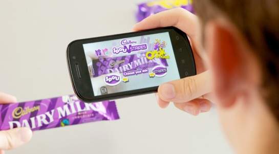
Image-recognition mobile applications have been developed to instantaneously bring what we read, see and touch to life in breathtaking augmented reality experiences.
The apps leading the technological charge are Blippar and Aurasma. Their creation has opened a door for brands to showcase themselves to consumers in remarkable ways. ‘Til now the platform has mainly been used on images in newspapers, ad billboards and magazines. Users who have downloaded the app activate it and hold their smartphone camera in front of compatible image to see it immediately transform and transfix.
Here are some examples of Blippar in action:
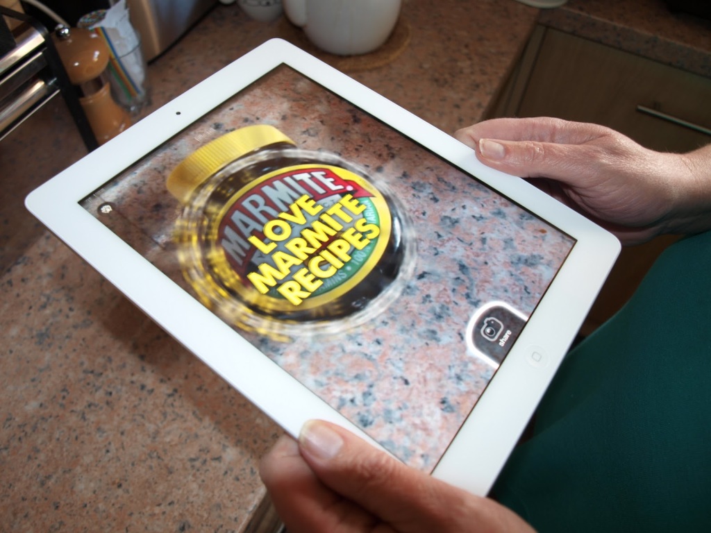
But what opportunities and innovations could apps like Blippar and Aurasma create for the packaging industry? The likes of Heinz, Marmite and Walkers have already used Blippar on their packs to display media such as recipes and interactive 3D games.
Soft drink brand Juice Burst have taken things a step further with their exploding fruit videos which play when their packs are viewed through the Blippar.
So we can see that sensations of taste and texture can be set alight by the technology and we can certainly add significant value to packaging. Perhaps this technology can succeed where QR codes failed in getting consumers to use their smartphones to interact with brands on a level beyond physical packaging. Its technological development is brilliant in itself but what it could hold for the future is truly exciting. How long will it be ’til we can smell chocolate by scanning an Oreo ad we see in the paper?
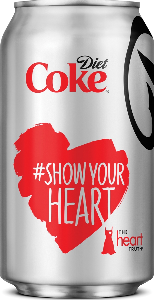
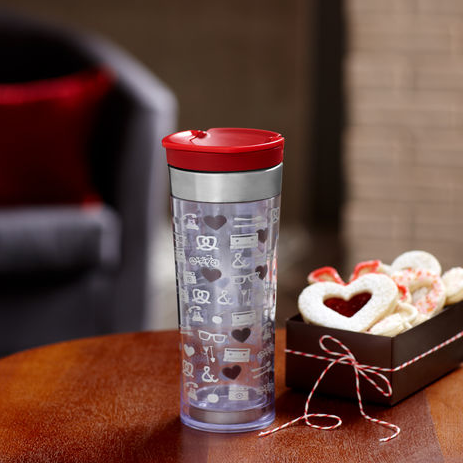
6 Designs to Fall in Love With this Valentine’s Day
It’s that time of the year again and we’re excited to see how brands are putting their hearts and souls into Valentine’s Day. To those keeping an eye on supermarket shelves and the brand world in general over the past few months, it’s been clear that many brands have taken to undressing their identities and focusing on simplicity and stylishness. This all filters down, as it should, to packaging. Increasingly, packs are all about cleaner shapes, simple lines and curves. Such features are ideal platforms upon which to to celebrate Valentines through limited edition and collaborative design. Get ready to choose your Valentine the perfect limited edition gift this year as packaging gets all affectionate.
We’ve taken a sneak peak at the lovely designs ready to make the 14th of February lovelier than ever.
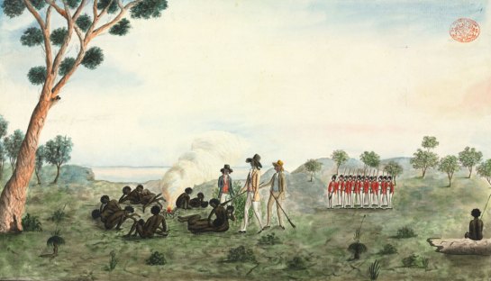
In 1788, a British fleet of 11 ships arrived on the shores of a land and declared it, Australia! It remains a mystery as to whether or not the brave sailors had limited edition Australia Day packaging design in mind when they commenced the colony, but we like to think that they did…
To commemorate the day in 2012, iconic Australian brand Vegemite changed its name to Australia for a limited time. The packs featured the pictures and bios of 10 everyday Australian people who had achieved something special. Find out who the deserving final 25 finalists were here.
Coles, the Australian supermarket chain, are going all out for January 26th this year. They will be the exclusive retailers for tons of limited edition patriotic products.
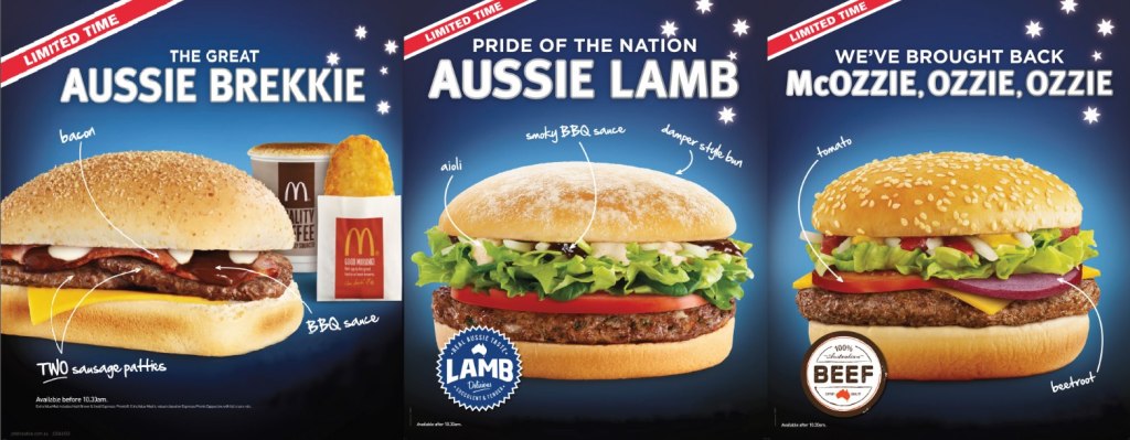
 McDoanld’s changed their name to Macca’s for a limited time as a celebration for Australia Day 2013. See their newly designed Macca’s menu and find out more about the campaign from the blog we wrote about it earlier this month.
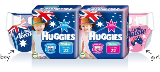
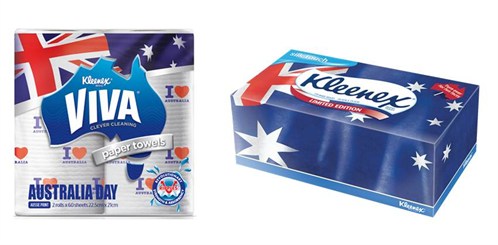
Kimberley Clark are marking this year’s Australia day with special edition packs for their brands; Huggies, Viva and Kleenex.
9 Designs that are Going Au Natural
As the demand for natural and organic products continues to rise, brands must find creative ways to communicate this information to the consumer as well as make sure their messages rises above the rest. Again, package design has a huge part to play in convincing consumers that the products they buy are as close to nature as possible.
When you think about it, natural products already come in their own packaging. (Every orange does come in it’s very own rind.) Using nature’s solution as inspiration, the following brands have developed a fresh and clever way to communicate that their products come directly from the source.
True Lemon was all too frequently mistaken for a flavouring or condiment when in fact it is an actual 100% lemon in a crystallized form. Packaging was essential in communicating that this product could be used exactly like lemon fruit. To accomplish this, our New York used a mouth-watering hyper-real illustration of the fruit’s skin. It’s proudly conveys the brand message that True Lemon is real lemon, only better, without the need for tons of copy. You can read more about our Pentaward winning design for True Lemon here.
Perhaps the most recognisable example in this trend has to be the timeless and truly unique Orangina bottle. The spherical lower half is shaped and textured like an orange fruit. There’s nothing like feeling the rotund weight of an ice cold Orangina in your grasp.
What better proof of ‘all natural ingredients’ than actually growing your own… well, product and packaging? Camp Nectar picked not only their juice boxes straight from the trees but also the fruits of their success.
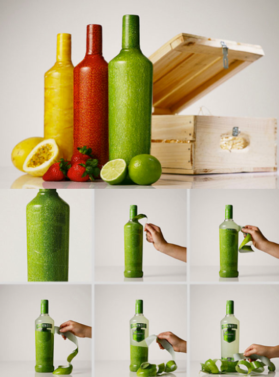
 All wrapped-up in a texture resembling true fruit peel, these Smirnoff bottles increase the suspense as you slowly reveal them almost tasting it before it reaches your lips.
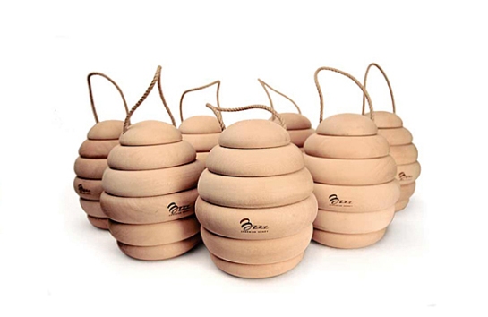
We all know that the best of honey comes straight from the heart of the beehive, this time the one created by Bzzz. Rest assured, there’s no chance of getting stung, apart from on your tongue from the beautiful honey.

These beverage cartons are completely covered in skin graphics in order to communicate the naturalness of their contents in a universal way.
These Jooze cartons gain shelf standout with fantastic structures that makes consumers just want to have a slice.
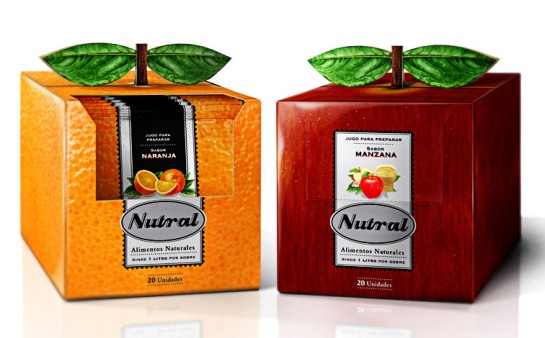
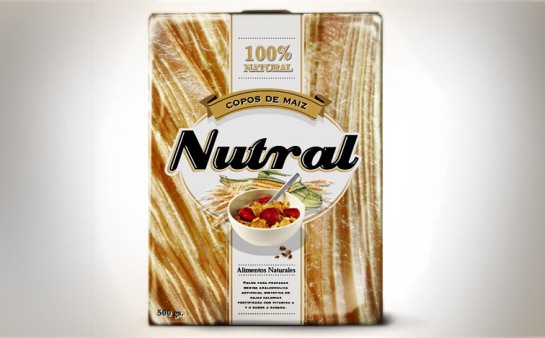
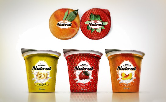
Argentinian agency NNSS applied this trend to their whole line of natural products, Nutral.
6 Brands Enjoying a Blast From the Past
Throughout 2012, we highlighted packaging trends that helped our supermarket shelves look sublime. Let’s take a look back at some of the beautiful and innovative pack designs that made our shopping worth it 2012.
CLING TO THE PAST: Trends in Retro Packaging
The ‘retro revival’ in packaging transported consumers back in time when things were simply, sexy and totally rad. Treading the fine line between the kitschy and classic can be tricky, but when done correctly, it can lead to products flying off the shelves. Especially when they come with the promise ‘limited time only’ implying that you can recapture the past, but not for long. Read the full post here.
DESIGN TO BARK ABOUT: Trends in Pet Packaging
Once resigned to a back-aisle of the grocery store, pet products became showcase-worthy. Read the full post here.
CRAFT WORK: Trends in Craft Beer Packaging
Localization became an increasingly central concern of our culture as we began to value it as a source of authenticity and accessibility. Thus, it was high time for craft beers to take center stage. Just as breweries explored new and unique flavors, they also experimented with vivid and offbeat packaging design. Read the full post here.
COMING UP ROSES: Trends in Gardening Packaging
Gardening became the hobby of choice of the hipster crowd. Brands responded with the creation of quick, easy, low maintenance gardening solutions. Best of all, they presented these solutions in wonderful packaging. Read the full post here.
5 Trends in Gardening Packaging
 In his satirical 18th century novella Candide, Voltaire offers this sage wisdom to escape the tragedy, despair and absolute absurdity of modern life: “We must tend to our garden.” It seems that this advice has particular and literal resonance today. From National Trust Estates to London allotments to Brooklyn rooftop gardens complete with beehives, it is clear that the happiness humans glean from growing things is trendy again.
To harness the power of this simplest of pleasures in an era of convenience, companies have started offering gardening kits with everything you need to cultivate your crop of choice. With these new, all-in-one gardens, it’s easy enough for anyone to have green fingers; they’ve also have allowed for some splendid packaging.
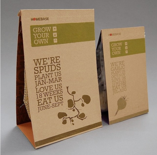
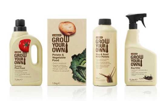
Homebase make gardening easy and accessible with their ‘Grow Your Own’ range.
The Grow Bottle from Potting Shed Creations is completely composed of sourced and re-purposed materials.
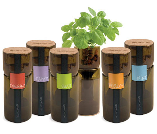 Packed in a small tin can, MicroGiardini plants make an easy way to grow herbs, vegetables and flowers in any indoor environment. Each can includes a set of hearty seeds or bulbs packed within a growing compound.
Humble Seed was set up in 2009 and has been utilising great design in the convenient gardening range ever since. Have a look at their website.
Just add water – it couldn’t be easier to grow this mini-tomato plant by Bristol based company Urbana.
Craft Work: Trends in Craft Beer Packaging
 Over the past 5 years, the US and to a lesser extent the UK, have seen a distinct shift within the beer industry. Against all the odds, big beer breweries are on the slow decline despite the fact that they possess such vast resources, experience, brand recognition and money (traits by which a company’s success is usually judged).
Instead, small craft breweries are growing at an alarming rate with an increase of 26% in the past 5 years. In relative terms this is 3 times more growth than the beer industry as a whole. The number of craft breweries has skyrocketed with only 100 craft breweries in 1970 compared to 2,000 today. So what’s causing this shift?
With leading brewers centrally focusing on profit, craft breweries focus more on the taste, quality and making a lasting impression. Craft brewers have taught consumers not to settle on what is merely cheap and readily available, but to take pride in their selections and choose the beer which best pleases their palate.
 Localization has become an increasingly central concern of our culture as we value it more as a source of authenticity and accessibility – this is what craft beers are all about. These localized brews have also established a place at the dinner table and in restaurants. Chefs are taking advantage of the flavor diversity available and formulating how craft beers can be paired with certain foods in the same way as wines.
Just as craft breweries explore with new and unique flavors, they also have experimented with vivid and offbeat packaging design. Take a look at some of the craft beers that are pioneering with unique flavors as well as eye-catching packaging.
8 Pack Designs Clinging onto the Good Old Days
Unimpressed by the sleek design that has come to represent the ‘Insta-Information Age,’ we’ve been harkening nostalgically back to another time – soaking up episodes of Mad Men, growing mustaches like Tom Selleck, and buying cereal boxes adorned with Atari graphics.
The ‘retro revival’ in packaging has made shopping fun again, transporting consumers back in time when things were simply, sexy and totally rad. Treading the fine line between the kitschy and classic can be tricky, but when done correctly, it can lead to products flying off the shelves. Especially when they come with the promise ‘limited time only’ implying that you can recapture the past, but not for long.
Marks & Spencer
To celebrate its 125th birthday, Marks & Spencer goes back to the original designs that made them one of the most successful groceries in the UK.

Mountain Dew
Mountain Dew’s ‘Throwback’ look was first introduced ‘just for the summer’ in 2009. Due to popular demand it’s still on sale today only without the original ‘limited time only’ banner!
Heinz
This summer Heinz re-launched pack designs from 1952, when Queen Elizabeth first took to the throne to commemorate her Diamond Jubilee year.

General Mills Cereals
In the US, General Mills brings back the 80’s childhood by partnering up with Atari games to reproduce the cereal boxes of that era for all their classic varieties, including Lucky Charms and Cheerio’s.

Kellogg’s Cereals
In the UK, Kellogg’s has produced 1950’s ‘Jubilee’ boxes for their classic varieties Corn Flakes, Frosties, CoCo Pops and Rice Crispies.
Doritos
Tortilla chip Doritos have reproduced their sixties packaging to coincide with the re release of their original ‘Taco Flavour’ recipe.
Retro packaging is clearly a very smart move, appealing not only to a sense of nostalgia, but also the younger generations desire to experience a part of a time that they’ve only ever seen lovingly evoked in films and television.
7 Pet Brand Pack Designs to Bark About
Once resigned to a back aisle of the grocery store, pet products have become showcase-worthy. In fact, some of these products might just have you throwing them into your cart before you remember you don’t even have a dog.
 Nootie shows that form can achieve both fun and functionality, packaging shampoo and a daily moisturizing spritz in one bottle: it’s where clean and convenient meet.
 As the most iconic health supplement in the pet industry, NubBone’s new design improves customer interaction, effectively communicates flavors and ingredients, and is more sustainable than the past plastic design.
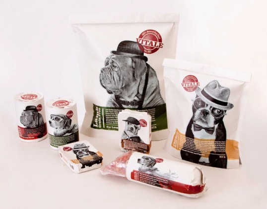 Student Sergey Grigoryan (Fort Hays State University) created this line for Vitale to visually represent dogs as “Man’s Best Friend.” The use of butcher paper is a nice added touch, evoking a hand-made feeling.
 My Cat Loves appeals to fussy cat owners and fussy cats alike. The pack marries wit and navigability with effortless precision: bright colors jump off shelf, and the sharply constructed flavors leave owners with no doubt that their cat will love the taste.
 Oh My Dog! is right. The brand understands that shampooing your pup is no easy feat, so they aimed to insert humor and light-heartedness into the process.
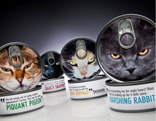 Combining bad cat photography with witty quotes from a feline perspective, Snookums positions their product for the cuddly kitten’s counterpart: the sassy cat with attitude.
 Purina’s Australian Ruffs line conveys natural, unrefined dog products without sacrificing humor and credibility. Doggishly good treats, with a doggishly good design.


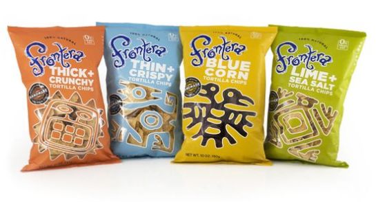

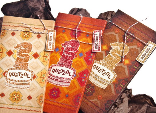

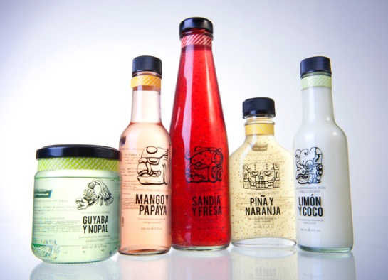


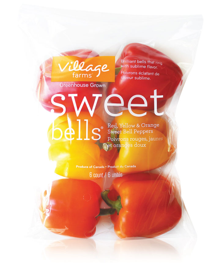


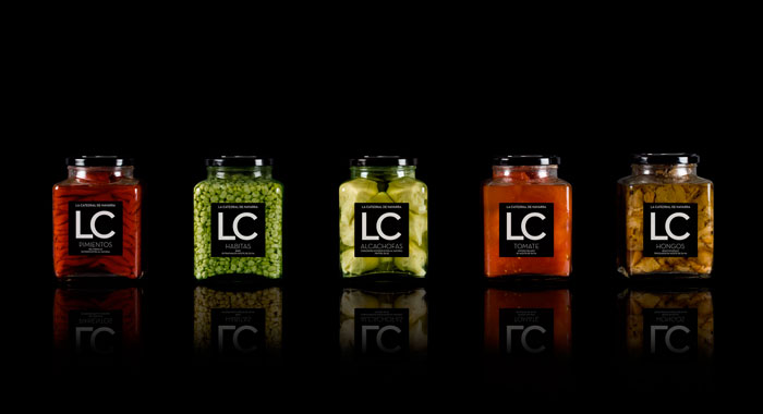
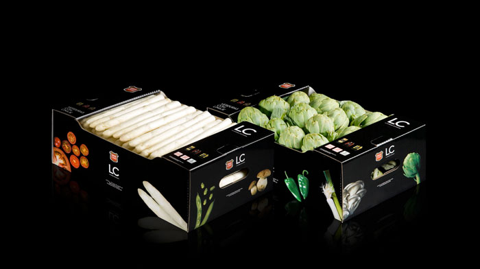
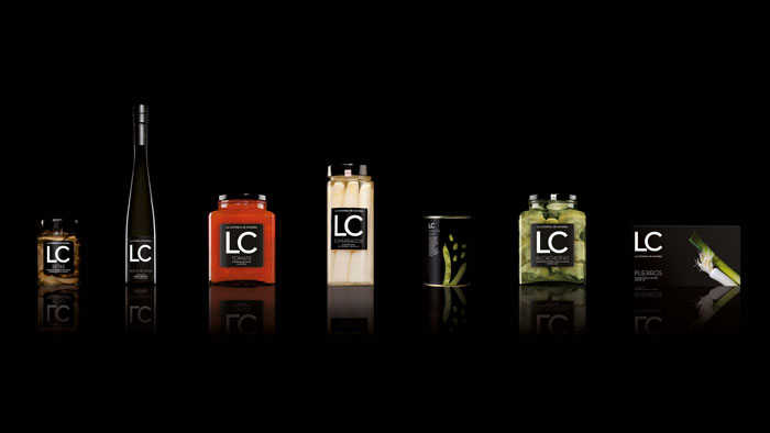
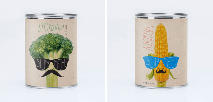
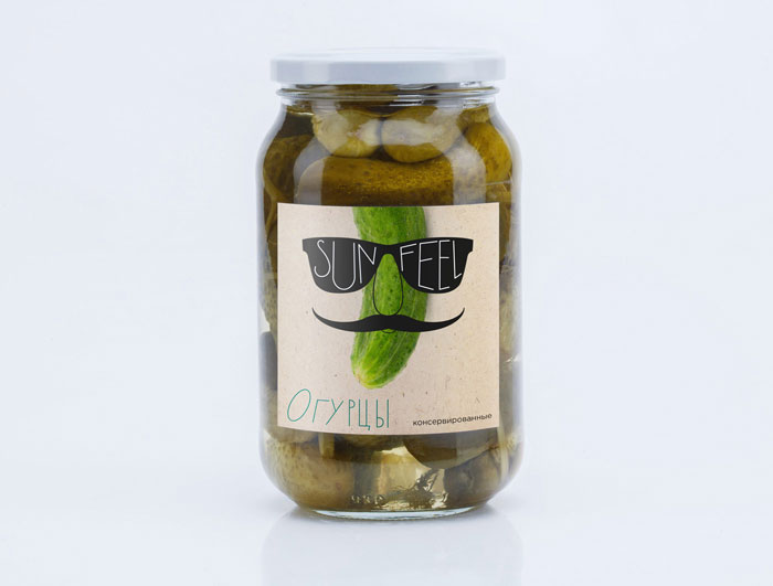
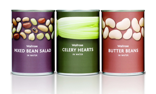
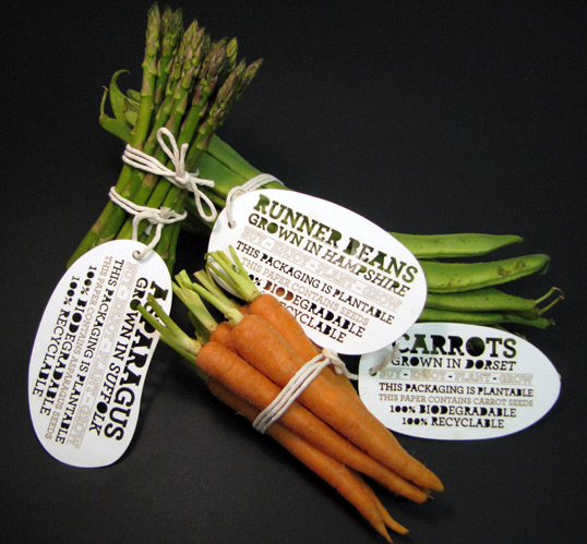
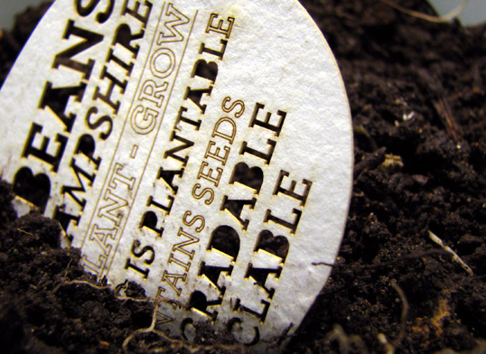
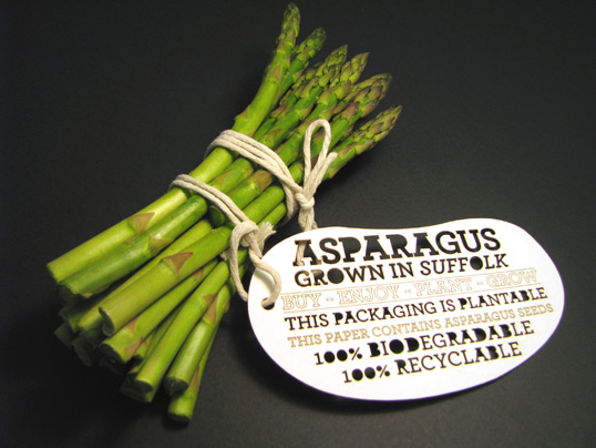
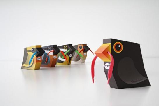
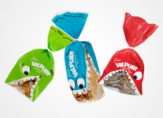
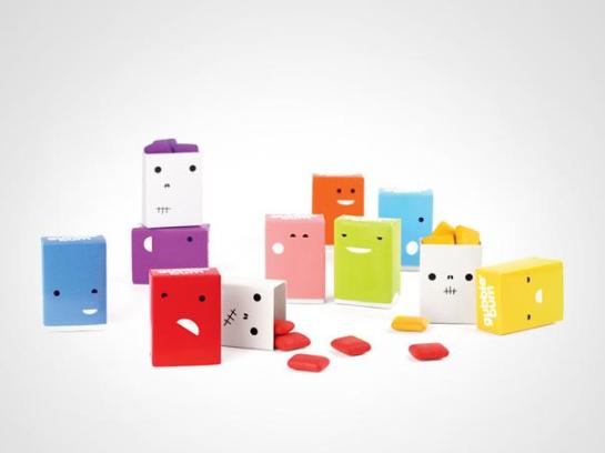
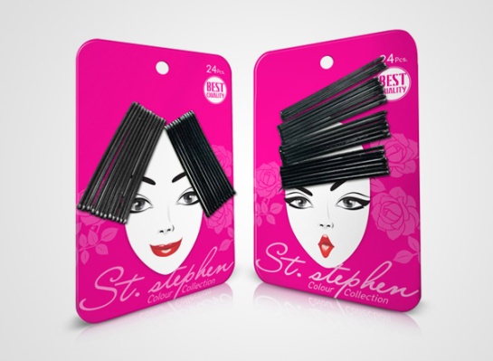
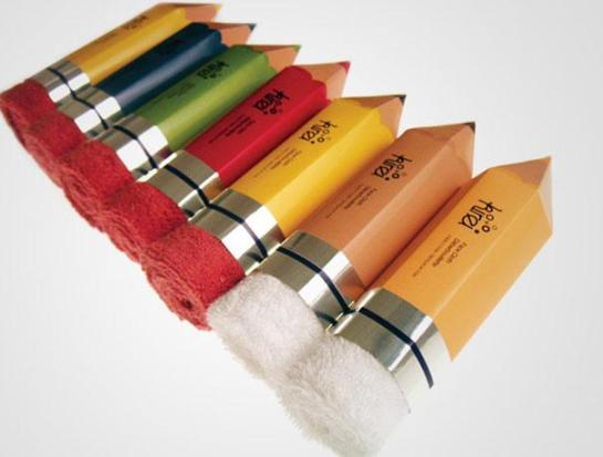
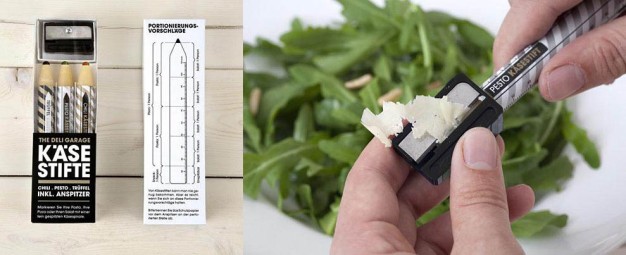
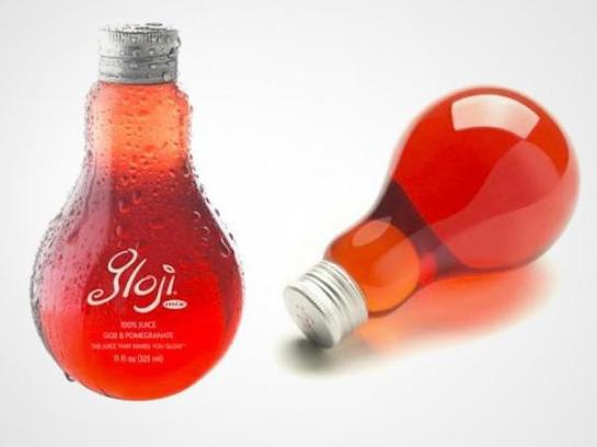
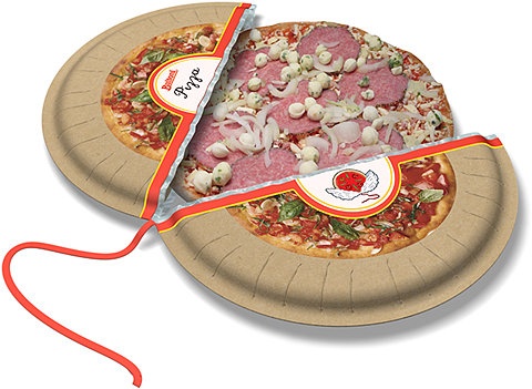
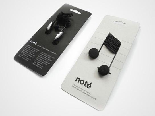
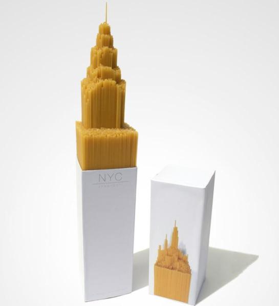
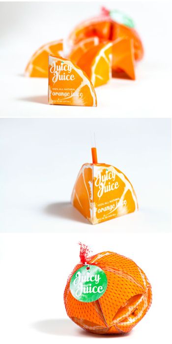
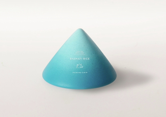
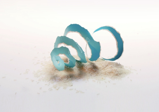

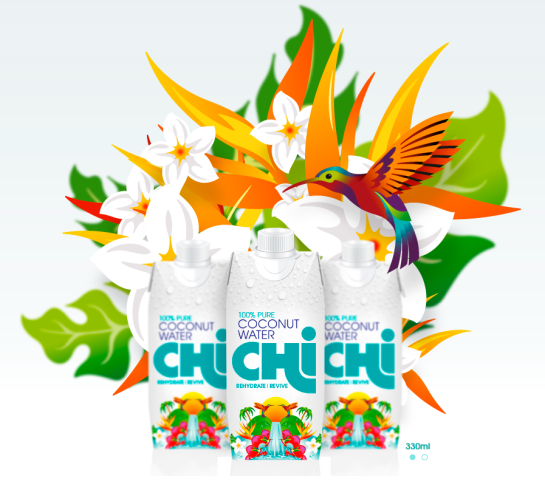
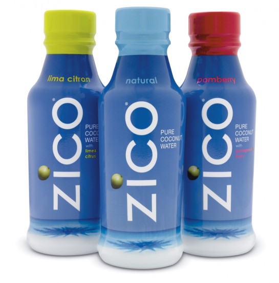
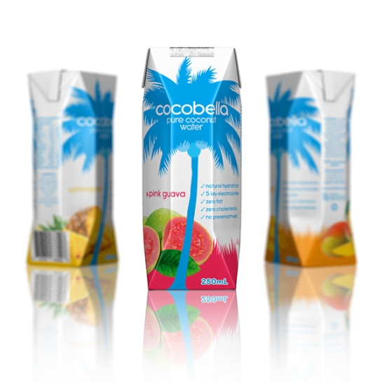
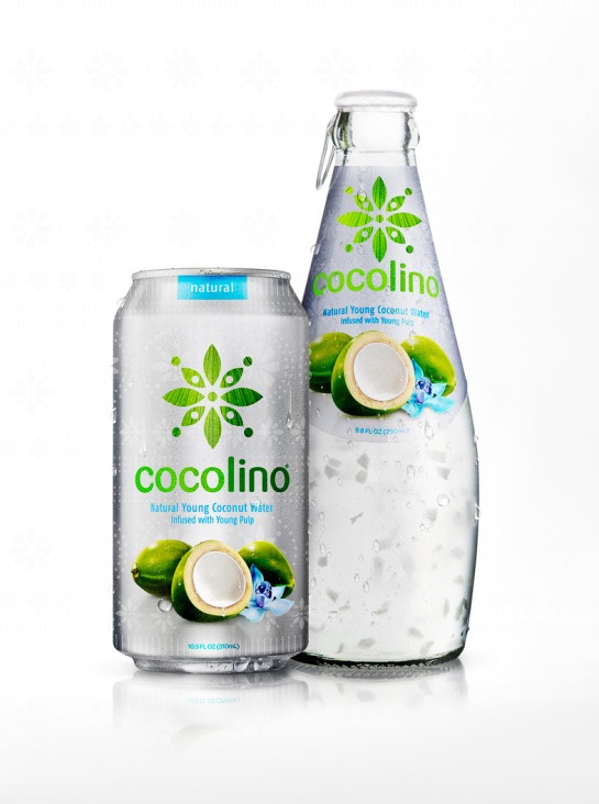
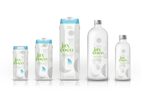
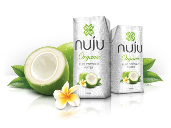
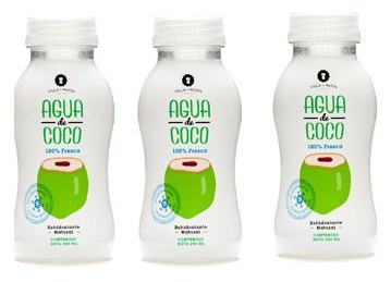
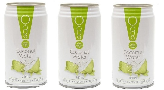
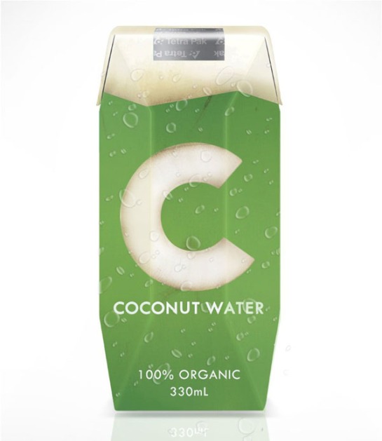
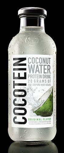
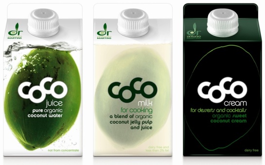
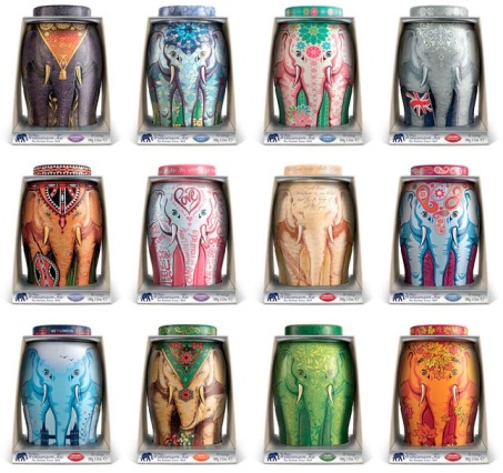
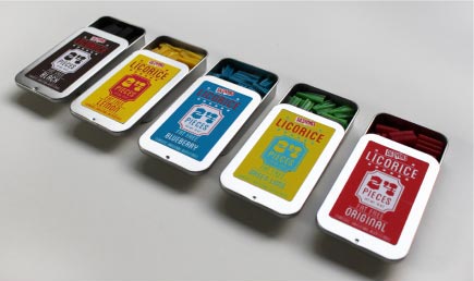
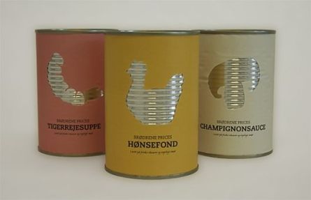
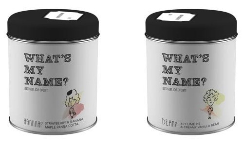
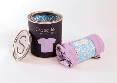
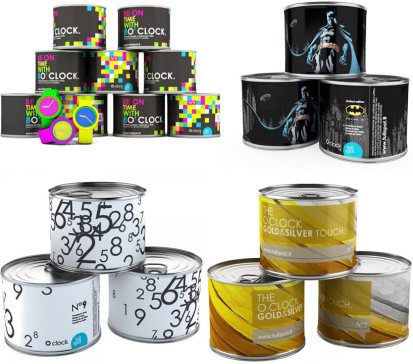
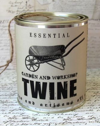
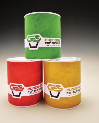
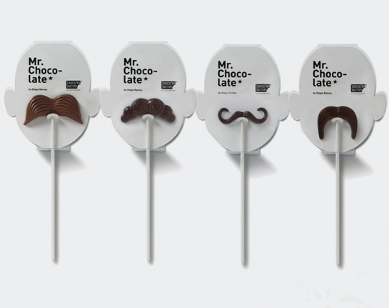
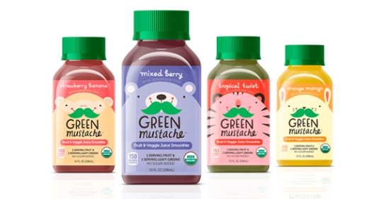
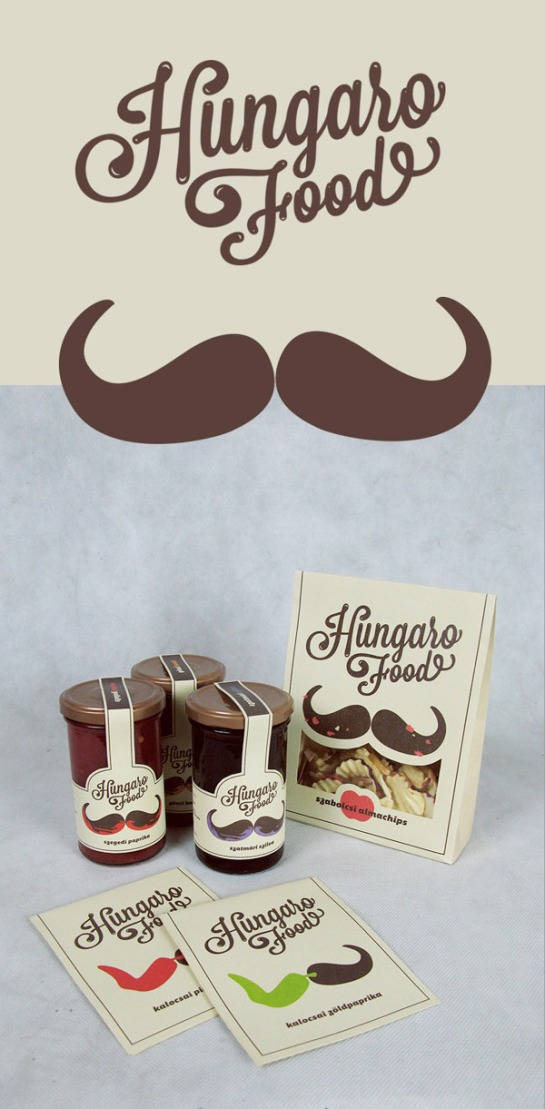
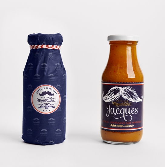
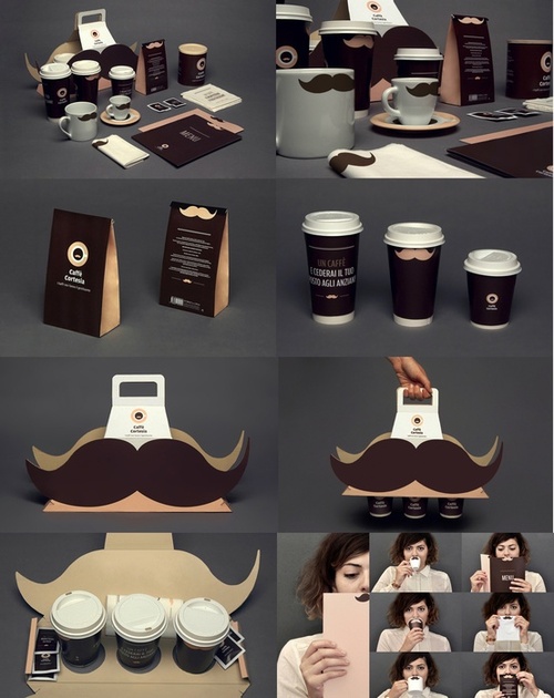
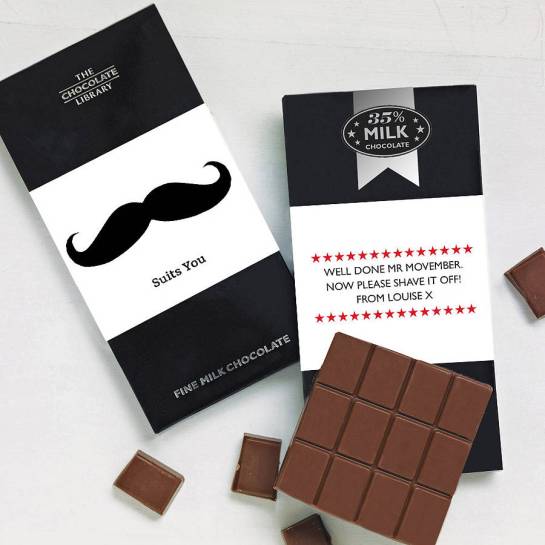
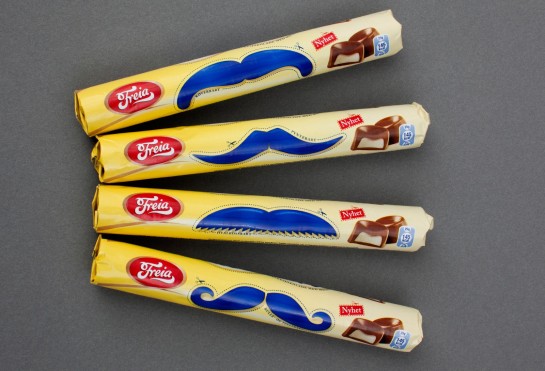
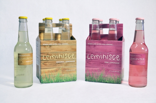
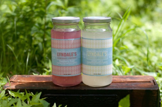
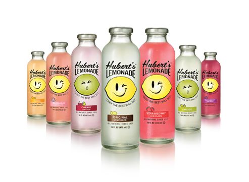
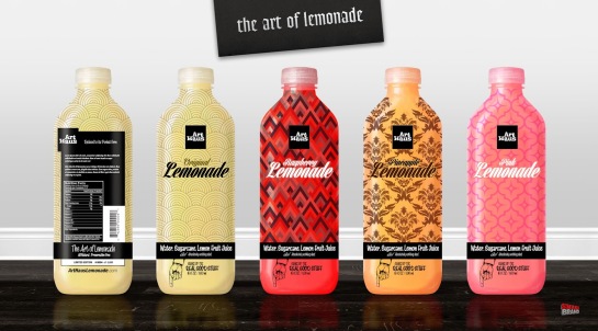
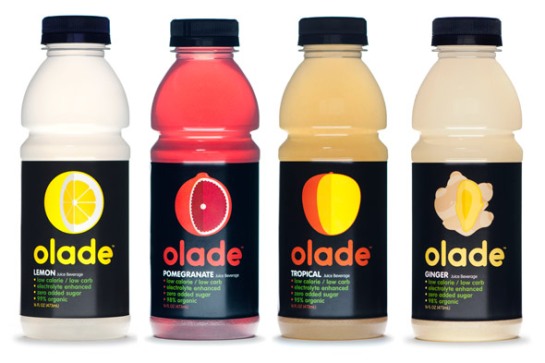
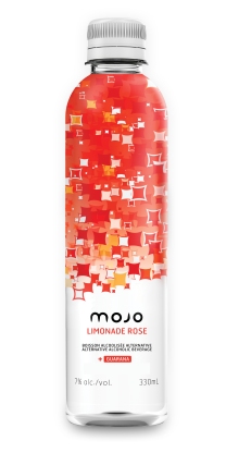

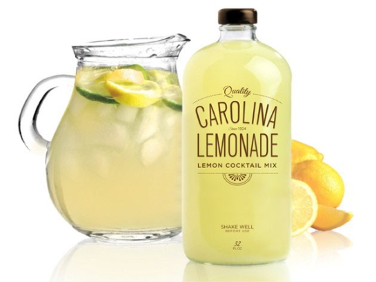
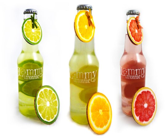
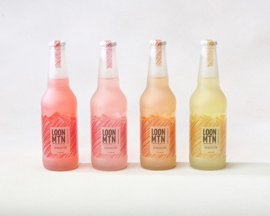
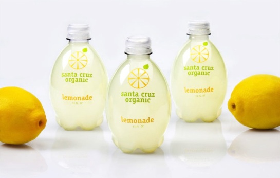
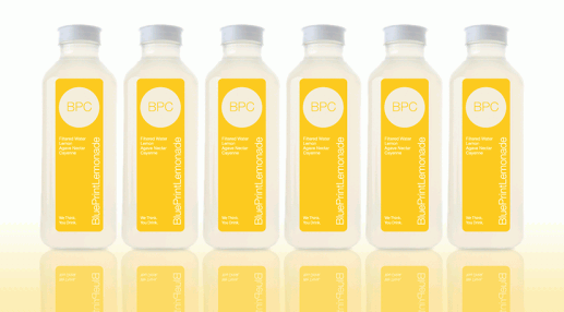
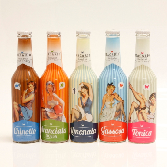
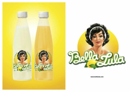
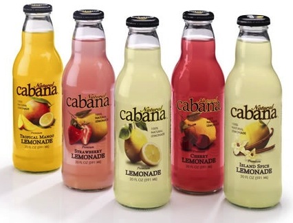
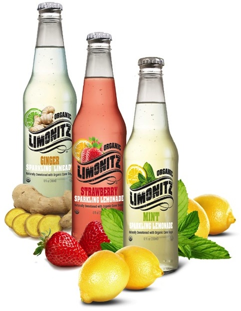
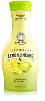
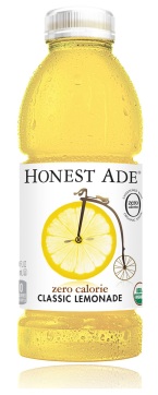
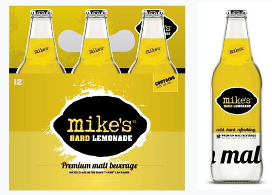
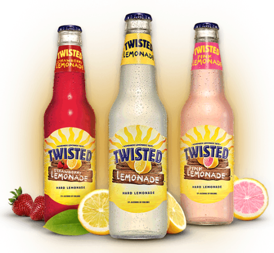
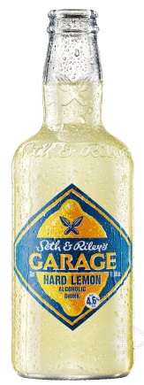
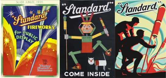
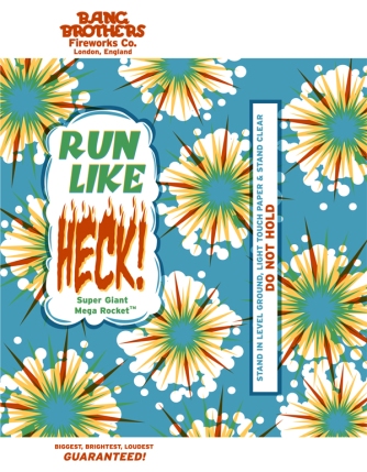
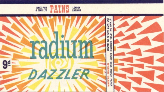
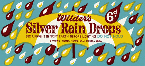
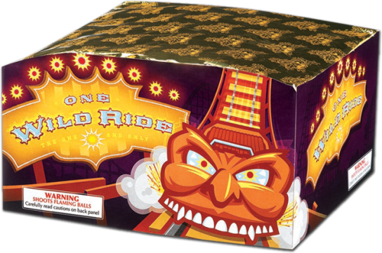
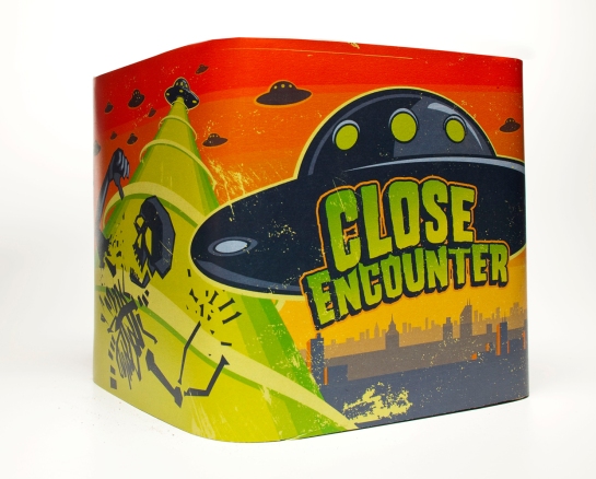
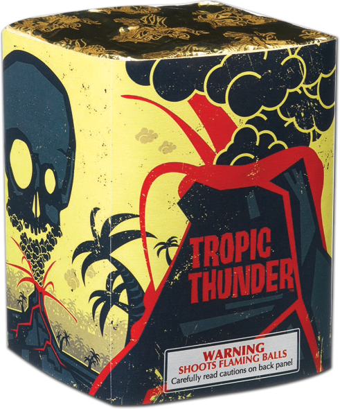
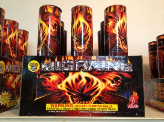
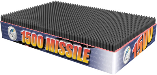
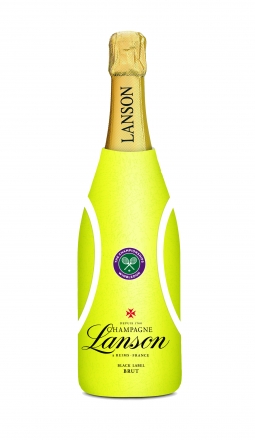
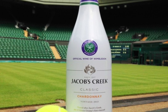
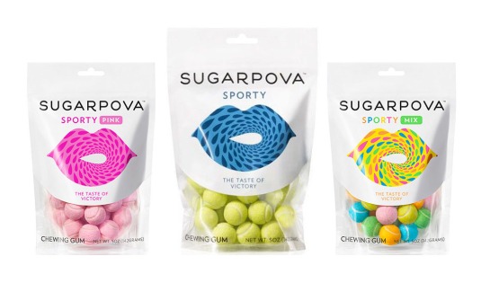
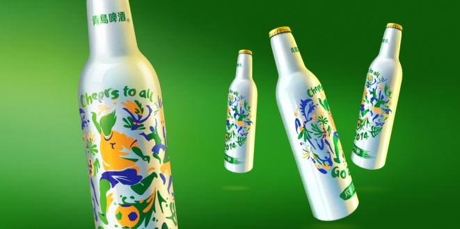
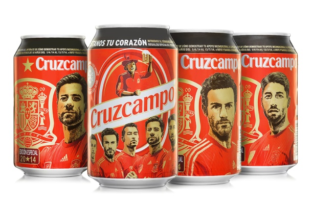
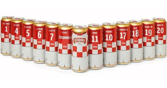
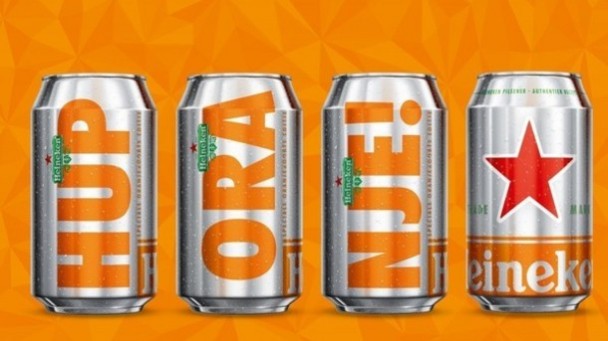
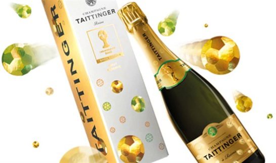
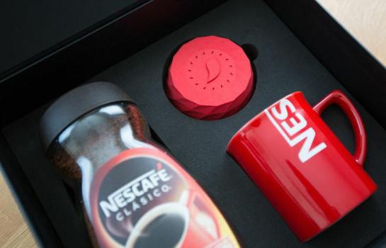
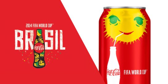
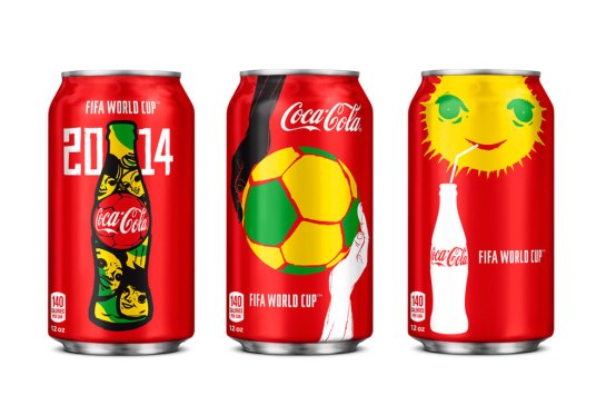
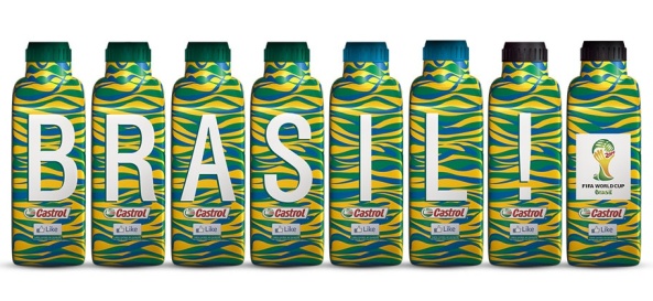
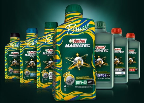
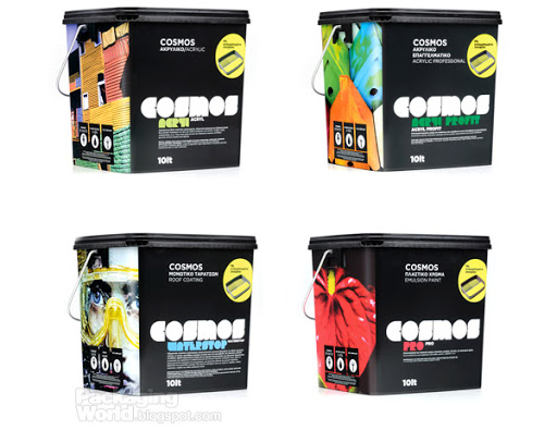
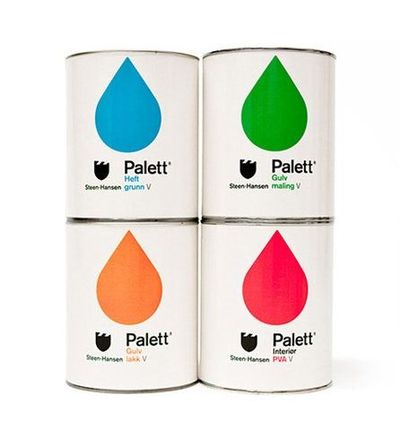
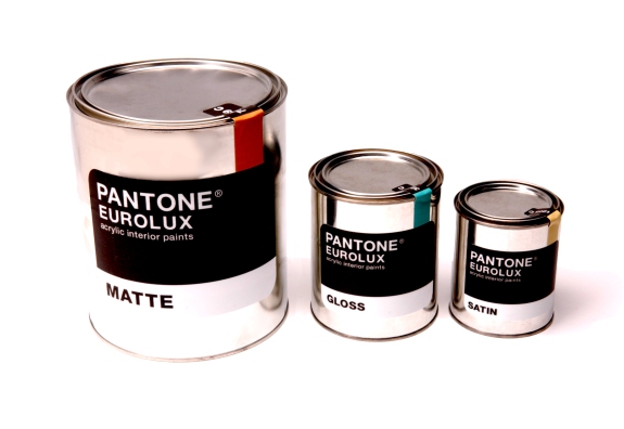
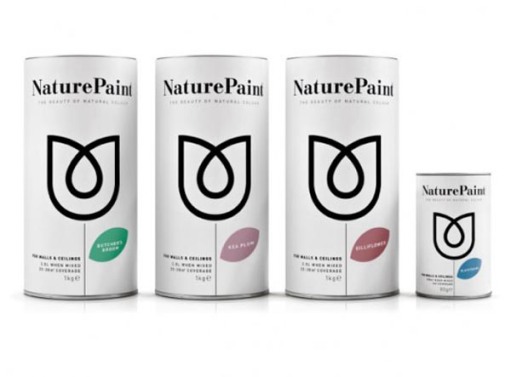
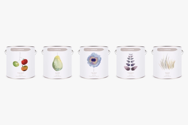
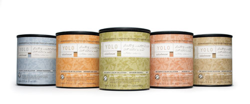
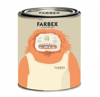
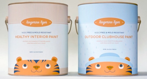
![valspar10071 copy[2]](http://thisisbravetalk.files.wordpress.com/2014/05/valspar10071-copy2.jpg?w=545&h=376)
